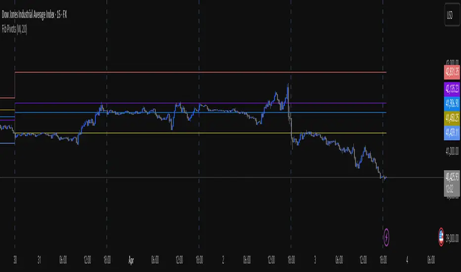
Fib Pivot Points HLThis TradingView indicator allows users to select a specific timeframe (TF) and then analyzes the high, low, and closing prices from the past period within that TF to calculate a central pivot point. The pivot point is determined using the formula (High + Close + Low) / 3, providing a key level around which the market is expected to pivot or change direction.
In addition to the central pivot point, the indicator enhances its utility by incorporating Fibonacci levels. These levels are calculated based on the range from the low to the high of the selected timeframe. For instance, a Fibonacci level like R0.38 would be calculated by adding 38% of the high-low range to the pivot point, giving traders potential resistance levels above the pivot.
Key features of this indicator include:
Timeframe Selection: Users can choose their desired timeframe, such as weekly, daily, etc., for analysis.
Pivot Point Calculation: The indicator calculates the pivot point based on the previous period's high, low, and closing prices within the selected timeframe.
Fibonacci Levels: Adds Fibonacci retracement levels to the pivot point, offering traders additional layers of potential support and resistance based on the natural Fibonacci sequence.
This indicator is particularly useful for traders looking to identify potential turning points in the market and key levels of support and resistance based on historical price action and the Fibonacci sequence, which is widely regarded for its ability to predict market movements.
Example:
Suppose you're analyzing the EUR/USD currency pair using this indicator with a weekly timeframe setting. The previous week's price action showed a high of 1.2100, a low of 1.1900, and the week closed at 1.2000.
Using the formula ( High + Close + Low ) / 3 (High+Close+Low)/3, the pivot point would be calculated as ( 1.2100 + 1.2000 + 1.1900 ) / 3 = 1.2000. Thus, the central pivot point for the current week is at 1.2000.
The range from the low to the high is 1.2100 − 1.1900 = 0.0200 1.2100−1.1900=0.0200.
To calculate a specific Fibonacci level, such as R0.38, you would add 38% of the high-low range to the pivot point: 1.2000 + ( 0.0200 ∗ 0.38 ) = 1.2076 1.2000+(0.0200∗0.38)=1.2076. Thus, the R0.38 Fibonacci resistance level is at 1.2076.
Similarly, you can calculate other Fibonacci levels such as S0.38 (Support level at 38% retracement) by subtracting 38% of the high-low range from the pivot point.
Traders can use the pivot point as a reference for the market's directional bias: prices above the pivot point suggest bullish sentiment, while prices below indicate bearish sentiment. The Fibonacci levels act as potential stepping stones for price movements, offering strategic points for entry, exit, or placing stop-loss orders.
Buscar en scripts para "high low"
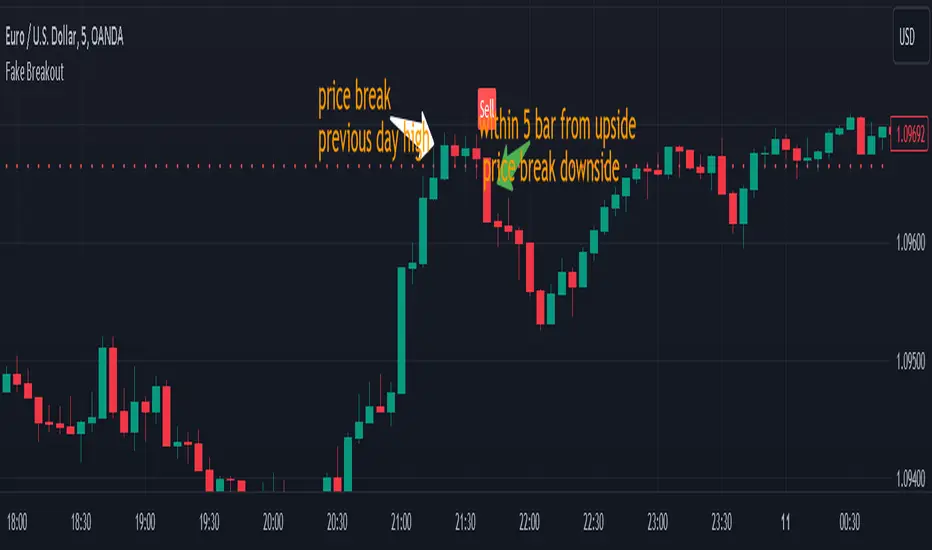
Fake BreakoutThis indicator detect fake breakout on previous day high/low and option previous swing high and low
Rule Detect Fake Breakout On Previous Day High/Low Or Swing high low Fake Breakout -
1) Detect previous day high/low or swing high/low
2)
A) If price revisit on previous day high/swing high look for upside breakout after input
number of candle (1-5) price came back to previous high and breakout happen downside
it show sell because its fake breakout of previous day high or swing high
B) If price revisit on previous day low/swing low look for downside breakout after input
number of candle (1-5) price came back to previous low and breakout upside of previous
day low it show Buy because its fake breakout of previous day low or swing low
Disclaimer -Traders can use this script as a starting point for further customization or as a reference for developing their own trading strategies. It's important to note that past performance is not indicative of future results, and thorough testing and validation are recommended before deploying any trading strategy.
Swing IdentifierThe "Swing Identifier" is a custom Pine Script indicator designed for use in the TradingView platform. It serves to visually identify and mark swing highs and swing lows on a trading chart, which are key concepts in technical analysis. This script is comprehensive and customizable, making it a useful tool for traders looking to pinpoint potential trend reversals and support or resistance areas.
**Key Features of the 'Swing Identifier' Indicator:**
1. **Swing Range Input:**
- This input determines the number of bars to the left and right of the current bar that the script will examine to identify a swing high or low. A larger value will look for swings over a broader range, potentially identifying more significant swings but at the expense of sensitivity.
2. **Swing Strength Input:**
- The swing strength is set as a percentage and is used to filter out insignificant price movements. A swing high or low is only considered valid if the percentage change from the last swing is greater than this input value. This feature helps in avoiding false signals in sideways or less volatile markets.
3. **Use Wicks Option:**
- Users can choose whether to consider the wicks of the candles or just the closing prices in identifying swings. This feature adds flexibility, allowing the script to be tailored to different trading styles and strategies.
4. **Line Color Customization:**
- The color of the lines marking the swings can be customized, enhancing the visual appeal and readability of the chart.
**Operational Mechanics:**
1. **Identification of Swing Highs and Lows:**
- The script uses the `ta.pivothigh` and `ta.pivotlow` functions to identify swing highs and lows. Whether it uses the high/low of the candles or their closing prices is determined by the user's choice in the "Use Wicks" option.
2. **Drawing and Updating Lines:**
- When a new swing high or low is identified, and it meets the percentage change criteria from the previous swing, a line is drawn from the last swing low to the current high (or vice versa). If a new swing high (or low) is identified that is higher (or lower) than the previous one, the old line is deleted, and a new line is drawn.
3. **Swing Update Logic:**
- The script maintains a toggle mechanism to look alternatively for highs and lows. This ensures that it sequentially identifies a high and then a low (or vice versa), which aligns with how actual market swings behave.
**Usage in Trading:**
1. **Identifying Trend Reversals:**
- By marking swing highs and lows, the script helps traders identify potential trend reversals. A break of a swing low in an uptrend or a swing high in a downtrend could signal a change in the prevailing trend.
2. **Support and Resistance:**
- Swing highs and lows often act as levels of support and resistance. Traders can use these levels for setting entry or exit points, stop losses, and take profit orders.
3. **Customization for Strategy:**
- The customizable nature of the script allows traders to adjust the parameters according to their trading strategy, time frame, and asset volatility.
In summary, the "Swing Identifier" is a versatile and customizable tool that aids in visually identifying crucial price swing points, thereby assisting traders in making informed decisions based on technical analysis principles.

Ticker Correlation Reference IndicatorHello,
I am super excited to be releasing this Ticker Correlation assessment indicator. This is a big one so let us get right into it!
Inspiration:
The inspiration for this indicator came from a similar indicator by Balipour called the Correlation with P-Value and Confidence Interval. It’s a great indicator, you should check it out!
I used it quite a lot when looking for correlations; however, there were some limitations to this indicator’s functionality that I wanted. So I decided to make my own indicator that had the functionality I wanted. I have been using this for some time but decided to actual spruce it up a bit and make it user friendly so that I could share it publically. So let me get into what this indicator does and, most importantly, the expanded functionality of this indicator.
What it does:
This indicator determines the correlation between 2 separate tickers. The user selects the two tickers they wish to compare and it performs a correlation assessment over a defaulted 14 period length and displays the results. However, the indicator takes this much further. The complete functionality of this indicator includes the following:
1. Assesses the correlation of all 4 ticker variables (Open, High, Low and Close) over a user defined period of time (defaulted to 14);
2. Converts both tickers to a Z-Score in order to standardize the data and provide a side by side comparison;
3. Displays areas of high and low correlation between all 4 variables;
4. Looks back over the consistency of the relationship (is correlation consistent among the two tickers or infrequent?);
5. Displays the variance in the correlation (there may be a statistically significant relationship, but if there is a high variance, it means the relationship is unstable);
6. Permits manual conversion between prices; and
7. Determines the degree of statistical significance (be it stable, unstable or non-existent).
I will discuss each of these functions below.
Function 1: Assesses the correlation of all 4 variables.
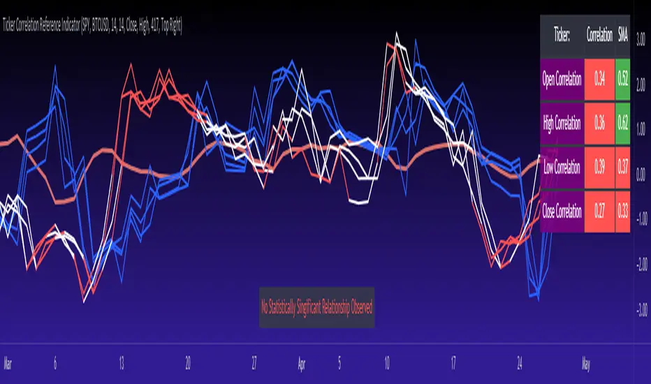
The only other indicator that does this only determines the correlation of the close price. However, correlation between all 4 variables varies. The correlation between open prices, high prices, low prices and close prices varies in statistically significant ways. As such, this indicator plots the correlation of all 4 ticker variables and displays each correlation.
Assessing this matters because sometimes a stock may not have the same magnitude in highs and lows as another stock (one stock may be more bullish, i.e. attain higher highs in comparison to another stock). Close price is helpful but does not pain the full picture. As such, the indicator displays the correlation relationship between all 4 variables (image below):
Function 2: Converts both tickers to Z-Score
Z-Score is a way of standardizing data. It simply measures how far a stock is trading in relation to its mean. As such, it is a way to express both tickers on a level playing field. Z-Score was also chosen because the Z-Score Values (0 – 4) also provide an appropriate scale to plot correlation lines (which range from 0 to 1).
The primary ticker (Ticker 1) is plotted in blue, the secondary comparison ticker (Ticker 2) is plotted in a colour changing format (which will be discussed below). See the image below:
Function 3: Displays areas of high and low correlation
While Ticker 1 is plotted in a static blue, Ticker 2 (the comparison ticker) is plotted in a dynamic, colour changing format. It will display areas of high correlation (i.e. areas with a P value greater than or equal to 0.9 or less than and equal to -0.9) in green, areas of moderate correlation in white. Areas of low correlation (between 0.4 and 0 or -0.4 and 0) are in red. (see image below):
Function 4: Checks consistency of relationship
While at the time of assessing a stock there very well maybe a high correlation, whether that correlation is consistent or not is the question. The indicator employs the use of the SMA function to plot the average correlation over a defined period of time. If the correlation is consistently high, the SMA should be within an area of statistical significance (over 0.5 or under -0.5). If the relationship is inconsistent, the SMA will read a lower value than the actual correlation.
You can see an example of this when you compare ETH to Tezos in the image below:
You can see that the correlation between ETH and Tezo’s on the high level seems to be inconsistent. While the current correlation is significant, the SMA is showing that the average correlation between the highs is actually less than 0.5.
The indicator also tells the user narratively the degree of consistency in the statistical relationship. This will be discussed later.
Function 5: Displays the variance
When it comes to correlation, variance is important. Variance simply means the distance between the highest and lowest value. The indicator assess the variance. A high degree of variance (i.e. a number surpassing 0.5 or greater) generally means the consistency and stability of the relationship is in issue. If there is a high variance, it means that the two tickers, while seemingly significantly correlated, tend to deviate from each other quite extensively.
The indicator will tell the user the variance in the narrative bar at the bottom of the chart (see image below):
Function 6: Permits manual conversion of price
One thing that I frequently want and like to do is convert prices between tickers. If I am looking at SPX and I want to calculate a price on SPY, I want to be able to do that quickly. This indicator permits you to do that by employing a regression based formula to convert Ticker 1 to Ticker 2.
The user can actually input which variable they would like to convert, whether they want to convert Ticker 1 Close to Ticker 2 Close, or Ticker 1 High to Ticker 2 High, or low or open.
To do this, open the settings and click “Permit Manual Conversion”. This will then take the current Ticker 1 Close price and convert it to Ticker 2 based on the regression calculations.
If you want to know what a specific price on Ticker 1 is on Ticker 2, simply click the “Allow Manual Price Input” variable and type in the price of Ticker 1 you want to know on Ticker 2. It will perform the calculation for you and will also list the standard error of the calculation.
Below is an example of calculating a SPY price using SPX data:
Above, the indicator was asked to convert an SPX price of 4,100 to a SPY price. The result was 408.83 with a standard error of 4.31, meaning we can expect 4,100 to fall within 408.83 +/- 4.31 on SPY.
Function 7: Determines the degree of statistical significance
The indicator will provide the user with a narrative output of the degree of statistical significance. The indicator looks beyond simply what the correlation is at the time of the assessment. It uses the SMA and the highest and lowest function to make an assessment of the stability of the statistical relationship and then indicates this to the user. Below is an example of IWM compared to SPY:
You will see, the indicator indicates that, while there is a statistically significant positive relationship, the relationship is somewhat unstable and inconsistent. Not only does it tell you this, but it indicates the degree of inconsistencies by listing the variance and the range of the inconsistencies.
And below is SPY to DIA:
SPY to BTCUSD:
And finally SPY to USDCAD Currency:
Other functions:
The indicator will also plot the raw or smoothed correlation result for the Open, High, Low or Close price. The default is to close price and smoothed. Smoothed just means it is displaying the SMA over the raw correlation score. Unsmoothing it will show you the raw correlation score.
The user also has the ability to toggle on and off the correlation table and the narrative table so that they can just review the chart (the side by side comparison of the 2 tickers).
Customizability
All of the functions are customizable for the most part. The user can determine the length of lookback, etc. The default parameters for all are 14. The only thing not customizable is the assessment used for determining the stability of a statistical relationship (set at 100 candle lookback) and the regression analysis used to convert price (10 candle lookback).
User Notes and important application tips:
#1: If using the manual calculation function to convert price, it is recommended to use this on the hourly or daily chart.
#2: Leaving pre-market data on can cause some errors. It is recommended to use the indicator with regular market hours enabled and extended market hours disabled.
#3: No ticker is off limits. You can compare anything against anything! Have fun with it and experiment!
Non-Indicator Specific Discussions:
Why does correlation between stocks mater?
This can matter for a number of reasons. For investors, it is good to diversify your portfolio and have a good array of stocks that operate somewhat independently of each other. This will allow you to see how your investments compare to each other and the degree of the relationship.
Another function may be getting exposure to more expensive tickers. I am guilty of trading IWM to gain exposure to SPY at a reduced cost basis :-).
What is a statistically significant correlation?
The rule of thumb is anything 0.5 or greater is considered statistically significant. The ideal setup is 0.9 or more as the effect is almost identical. That said, a lot of factors play into statistical significance. For example, the consistency and variance are 2 important factors most do not consider when ascertaining significance. Perhaps IWM and SPY are significantly correlated today, but is that a reliable relationship and can that be counted on as a rule?
These are things that should be considered when trading one ticker against another and these are things that I have attempted to address with this indicator!
Final notes:
I know I usually do tutorial videos. I have not done one here, but I will. Check back later for this.
I hope you enjoy the indicator and please feel free to share your thoughts and suggestions!
Safe trades all!
NSDT Lattice WebThis script creates a "web" by connecting different points of candles. All configurable by the trader.
There are 4 basic parts to a candle:
Open, High, Low, and Close
With this script, you can connect any point of one candle in the past to any point of another current candle.
For example:
High to High, High to Low, High to Open, High to close
Low to High, Low to Low, Low to Open, Low to Close
Open to High, Open to Low, Open to Open, Open to Close
Close to High, Close to Low, Close to Open, Close to Close
The script will change the line colors based on whether the current plot is higher or lower than the previous plot.
Try out different connection points to see what works for you. Connecting High to High and Low to Low, might easily show you when the market is making higher highs or lower lows, indicating a potential movement.
Run it on replay at a higher speed and see how it may potentially help identify area of congestion or trends.

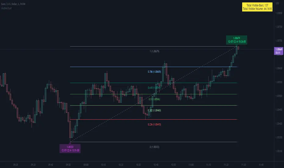
VisibleChart█ OVERVIEW
This library is a Pine programmer’s tool containing functions that return values calculated from the range of visible bars on the chart.
This is now possible in Pine Script™ thanks to the recently-released chart.left_visible_bar_time and chart.right_visible_bar_time built-ins, which return the opening time of the leftmost and rightmost bars on the chart. These values update as traders scroll or zoom their charts, which gives way to a class of indicators that can dynamically recalculate and draw visuals on visible bars only, as users scroll or zoom their charts. We hope this library's functions help you make the most of the world of possibilities these new built-ins provide for Pine scripts.
For an example of a script using this library, have a look at the Chart VWAP indicator.
█ CONCEPTS
Chart properties
The new chart.left_visible_bar_time and chart.right_visible_bar_time variables return the opening time of the leftmost and rightmost bars on the chart. They are only two of many new built-ins in the `chart.*` namespace. See this blog post for more information, or look them up by typing "chart." in the Pine Script™ Reference Manual .
Dynamic recalculation of scripts on visible bars
Any script using chart.left_visible_bar_time or chart.right_visible_bar_time acquires a unique property, which triggers its recalculation when traders scroll or zoom their charts in such a way that the range of visible bars on the chart changes. This library's functions use the two recent built-ins to derive various values from the range of visible bars.
Designing your scripts for dynamic recalculation
For the library's functions to work correctly, they must be called on every bar. For reliable results, assign their results to global variables and then use the variables locally where needed — not the raw function calls.
Some functions like `barIsVisible()` or `open()` will return a value starting on the leftmost visible bar. Others such as `high()` or `low()` will also return a value starting on the leftmost visible bar, but their correct value can only be known on the rightmost visible bar, after all visible bars have been analyzed by the script.
You can plot values as the script executes on visible bars, but efficient code will, when possible, create resource-intensive labels, lines or tables only once in the global scope using var , and then use the setter functions to modify their properties on the last bar only. The example code included in this library uses this method.
Keep in mind that when your script uses chart.left_visible_bar_time or chart.right_visible_bar_time , your script will recalculate on all bars each time the user scrolls or zooms their chart. To provide script users with the best experience you should strive to keep calculations to a minimum and use efficient code so that traders are not always waiting for your script to recalculate every time they scroll or zoom their chart.
Another aspect to consider is the fact that the rightmost visible bar will not always be the last bar in the dataset. When script users scroll back in time, a large portion of the time series the script calculates on may be situated after the rightmost visible bar. We can never assume the rightmost visible bar is also the last bar of the time series. Use `barIsVisible()` to restrict calculations to visible bars, but also consider that your script can continue to execute past them.
Look first. Then leap.
█ FUNCTIONS
The library contains the following functions:
barIsVisible()
Condition to determine if a given bar is within the users visible time range.
Returns: (bool) True if the the calling bar is between the `chart.left_visible_bar_time` and the `chart.right_visible_bar_time`.
high()
Determines the value of the highest `high` in visible bars.
Returns: (float) The maximum high value of visible chart bars.
highBarIndex()
Determines the `bar_index` of the highest `high` in visible bars.
Returns: (int) The `bar_index` of the `high()`.
highBarTime()
Determines the bar time of the highest `high` in visible bars.
Returns: (int) The `time` of the `high()`.
low()
Determines the value of the lowest `low` in visible bars.
Returns: (float) The minimum low value of visible chart bars.
lowBarIndex()
Determines the `bar_index` of the lowest `low` in visible bars.
Returns: (int) The `bar_index` of the `low()`.
lowBarTime()
Determines the bar time of the lowest `low` in visible bars.
Returns: (int) The `time` of the `low()`.
open()
Determines the value of the opening price in the visible chart time range.
Returns: (float) The `open` of the leftmost visible chart bar.
close()
Determines the value of the closing price in the visible chart time range.
Returns: (float) The `close` of the rightmost visible chart bar.
leftBarIndex()
Determines the `bar_index` of the leftmost visible chart bar.
Returns: (int) A `bar_index`.
rightBarIndex()
Determines the `bar_index` of the rightmost visible chart bar.
Returns: (int) A `bar_index`
bars()
Determines the number of visible chart bars.
Returns: (int) The number of bars.
volume()
Determines the sum of volume of all visible chart bars.
Returns: (float) The cumulative sum of volume.
ohlcv()
Determines the open, high, low, close, and volume sum of the visible bar time range.
Returns: ( ) A tuple of the OHLCV values for the visible chart bars. Example: open is chart left, high is the highest visible high, etc.
chartYPct(pct)
Determines a price level as a percentage of the visible bar price range, which depends on the chart's top/bottom margins in "Settings/Appearance".
Parameters:
pct : (series float) Percentage of the visible price range (50 is 50%). Negative values are allowed.
Returns: (float) A price level equal to the `pct` of the price range between the high and low of visible chart bars. Example: 50 is halfway between the visible high and low.
chartXTimePct(pct)
Determines a time as a percentage of the visible bar time range.
Parameters:
pct : (series float) Percentage of the visible time range (50 is 50%). Negative values are allowed.
Returns: (float) A time in UNIX format equal to the `pct` of the time range from the `chart.left_visible_bar_time` to the `chart.right_visible_bar_time`. Example: 50 is halfway from the leftmost visible bar to the rightmost.
chartXIndexPct(pct)
Determines a `bar_index` as a percentage of the visible bar time range.
Parameters:
pct : (series float) Percentage of the visible time range (50 is 50%). Negative values are allowed.
Returns: (float) A time in UNIX format equal to the `pct` of the time range from the `chart.left_visible_bar_time` to the `chart.right_visible_bar_time`. Example: 50 is halfway from the leftmost visible bar to the rightmost.
whenVisible(src, whenCond, length)
Creates an array containing the `length` last `src` values where `whenCond` is true for visible chart bars.
Parameters:
src : (series int/float) The source of the values to be included.
whenCond : (series bool) The condition determining which values are included. Optional. The default is `true`.
length : (simple int) The number of last values to return. Optional. The default is all values.
Returns: (float ) The array ID of the accumulated `src` values.
avg(src)
Gathers values of the source over visible chart bars and averages them.
Parameters:
src : (series int/float) The source of the values to be averaged. Optional. Default is `close`.
Returns: (float) A cumulative average of values for the visible time range.
median(src)
Calculates the median of a source over visible chart bars.
Parameters:
src : (series int/float) The source of the values. Optional. Default is `close`.
Returns: (float) The median of the `src` for the visible time range.
vVwap(src)
Calculates a volume-weighted average for visible chart bars.
Parameters:
src : (series int/float) Source used for the VWAP calculation. Optional. Default is `hlc3`.
Returns: (float) The VWAP for the visible time range.
Advanced Market Structure [Rogman]Rogman's Advanced Market Structure Indicator
The Ultimate All-in-One Market Structure Analysis Tool for TradingView
Take your technical analysis to the next level with a comprehensive, professional-grade tool designed for traders who demand precision and clarity in their charts.
🎯 Who Is This For?
ICT/SMC Traders seeking liquidity zones and market structure analysis
Day Traders monitoring session-based price action and kill zones
Swing Traders identifying key higher timeframe levels
Price Action Traders analyzing structure breaks and trend changes
Any Serious Trader wanting a clean, comprehensive market structure overlay
✨ Key Features
📊 Market Sessions Visualization
Track the three major trading sessions with our unique bracket-style display:
Asia, London, and New York sessions are clearly marked
Sessions display as SESSION ════════════ below price action
Smart vertical stacking prevents overlapping when sessions have similar lows
Fully customizable session times for any timezone
Perfect for identifying session highs/lows and optimal kill zone timing
📈 Higher Timeframe (HTF) Levels
Never miss a key level again:
Display Daily and Weekly Open, High, and Low levels
Instant visual reference for HTF support and resistance
Separate color controls for lines and labels
Choose from Solid, Dashed, or Dotted line styles
Essential for determining HTF bias and key decision points
🔄 Automatic Swing Detection
Let the indicator do the heavy lifting:
Auto-detection of swing highs (▼) and swing lows (▲)
Configurable lookback period for sensitivity adjustment
Optional horizontal level lines extending from swing points
Customizable colors, widths, and line styles
Identify potential reversal points and structure levels instantly
💧 Liquidity Zone Mapping
See where the money is hiding:
Automatic identification of buy-side liquidity (above swing highs)
Automatic identification of sell-side liquidity (below swing lows)
Visual zones show where stop losses are clustered
Real-time tracking when liquidity gets swept
Swept zones change color — know when liquidity has been taken
📉 Multi-Method Trend Detection
Three powerful methods to confirm trend direction:
Swing Structure — Based on higher highs/lows or lower highs/lows
EMA — Trend based on price position relative to EMA
Supertrend — Uses the popular Supertrend indicator
Features include:
Optional background coloring for at-a-glance trend identification
Real-time trend status label (UPTREND/DOWNTREND/NEUTRAL)
Customizable colors and transparency
🏷️ HH/HL/LH/LL Labels
Automatic market structure labeling:
HH (Higher High) — Bullish continuation signal
HL (Higher Low) — Bullish continuation signal
LH (Lower High) — Bearish continuation signal
LL (Lower Low) — Bearish continuation signal
Color-coded for instant visual recognition
📋 Information Dashboard
All critical data at a glance:
Current ticker symbol
Trend direction and status
Daily and Weekly bias
Last swing high and low prices
Active liquidity zone count
Positionable in any corner of your chart
🔔 Built-in Alerts
Never miss a key event:
Trend change alerts (Bullish/Bearish)
Swing high/low formation alerts
Set up notifications for critical market structure changes
🎨 Fully Customizable
Every feature can be:
Toggled on/off individually via the Feature Toggles menu
Color customized to match your chart theme
Size adjusted for optimal visibility
Fine-tuned with sensitivity parameters
Organized settings groups make configuration intuitive and fast.
🚀 Why Choose This Indicator?
Feature: Benefit: All-in-One Solution. Replace multiple indicators with one comprehensive tool. Clean Design and Thoughtful visual hierarchy keep charts readable. Smart Overlap Prevention. Session bars automatically stack to avoid visual clutter. Real-Time Updates: All elements update dynamically as the price moves. Professional Quality-Built with best practices in Pine Script v6. Extensive Documentation, clear code comments, and an organized structure
📖 How to Use
Add the indicator to your TradingView chart
Enable/disable features using the Feature Toggles menu
Customize colors and settings to match your preferences
Adjust session times for your timezone
Set up alerts for trend changes and swing formations
Pro Tips:
Use session times to identify optimal entry windows during kill zones
Watch for price sweeping liquidity zones before looking for reversals
Combine HTF bias with lower timeframe entries for higher probability trades
Use swing levels as potential support/resistance for entries and targets
Monitor the dashboard for a quick market assessment before trading
⚠️ Disclaimer
This indicator is provided for educational and informational purposes only. It does not constitute financial advice. Trading involves substantial risk and is not suitable for all investors. Past performance is not indicative of future results. Always conduct your own analysis and consider your financial situation before making trading decisions.

OiDeer (Session Map+Open+VWAP+PrevDay+VIX bands)Overview
Intraday context pack for NSE symbols that overlays Prev Close (official 15:30), Prev Day High/Low, Daily Open, 1st Candle Open, VWAP, an optional centered 100-point grid, and Expected High/Low bands derived from India VIX (Open).
It also computes remaining points to reach the expected bands for today (live) and for every historical session.
What it plots
Prev Close (yesterday 15:30 cash close) extended across today.
Prev Day High/Low extended across today.
Daily Open and Intraday 1st Candle Open (today only).
VWAP (session).
Expected High/Low from India VIX(Open) with optional √time intraday scaling.
Remaining points labels:
Today: points from today’s High → Exp High and today’s Low → Exp Low (also shown in Data Window).
Historical: for each completed day, points that were remaining from that day’s High/Low to its expected High/Low.
100-point centered grid (…00 levels by default; shift via Base Offset).
All labels are anchored at the session start bar (arrow on day boundary) with the label box rendered to the left so current candles stay unobstructed.
VIX math (expected move)
Daily σ: (VIX_open / 100) / √252.
Intraday option (today only): multiply by √(elapsed_minutes / 375).
Expected % move: k * daily_sigma * (√fraction if enabled).
Bands around reference S (choose Open, Prev Close, or Last):
ExpHigh = S + S * expected_pct
ExpLow = S - S * expected_pct
Historical sessions use that day’s VIX(Open) and reference S (no intraday scaling).
Inputs
Prev Close / PDH / PDL: show/hide, label toggles, colors, widths.
Daily/1st Candle Open, VWAP: show/hide; labels sit left of day start.
India VIX Bands: k (sigma), Reference Price (Open / Prev Close / Last), √time scaling toggle, colors, label toggles.
Remaining to Exp Bands: show labels, Clamp to 0 (no negatives), show in Data Window.
100-Point Grid: step, base offset, style, count above/below, color/width.
Label size control.
Data Window
Pts→Exp High (from Day High)
Pts→Exp Low (from Day Low)
Pts→Exp High (from Close)
Pts→Exp Low (from Close)
100pt lines ABOVE/BELOW (from current price)
Notes
Assumes NSE cash session 09:15–15:30 IST (375 min).
Prev Close uses official cash close at 15:30.
Designed for NSE symbols; India VIX source: NSE:INDIAVIX (Daily Open).
No alerts in this version.
Tips
Use k = 1.0 for ~1σ feel; try 1.5–2.0 for wider envelopes.
Open as reference is clean for intraday; Prev Close is gap-aware.
Turn on √time scaling if you prefer bands that widen through the day.
Disclaimer
For research and visualization only, not trading advice. Markets can exceed modeled ranges—use your own risk management.

MB-MACD## Description
**MB-MACD** is a custom Pine Script indicator designed to enhance momentum analysis by combining a volume-based "Main Buy Ratio" (MB) calculation with a traditional MACD oscillator. The MB Ratio estimates institutional buying pressure by apportioning volume based on the candle's range and close position, providing a unique proxy for "smart money" flow. This smoothed MB value is then used as the source for MACD computation, allowing for divergence detection between price action, the MB line, and the MACD Histogram.
Key features include:
- **MB Line**: A histogram-style plot showing smoothed buy/sell ratio, colored bullishly (teal) or bearishly (pink) based on direction.
- **MACD Histogram**: Standard MACD applied to the MB source, with optional smoothing.
- **Divergence Detection**: Identifies bullish and bearish divergences on both the MB line and MACD Histogram, with configurable filters for momentum decay and zero-line alignment.
- **Visualization Options**: Display divergence lines and labels in the indicator pane or synced as an overlay on the main chart for better context.
- **Alerts**: Triggers for bullish or bearish divergences to notify users of potential reversal setups.
This indicator is particularly useful for swing traders and momentum followers looking to spot hidden divergences that may signal trend reversals or continuations. It emphasizes risk management by highlighting where price and momentum decouple, but remember: divergences are probabilistic signals and should be confirmed with other tools.
As this is a community-shared script, I encourage users to test it thoroughly and provide feedback. If you spot any bugs, calculation errors, or improvements (e.g., edge cases with low-volume symbols or performance issues on certain timeframes), please comment below or reach out—your input helps refine it for everyone!
## User Manual
### Introduction
The **MB-MACD** indicator integrates volume analysis with MACD to detect divergences in price and momentum. The core innovation is the "Main Buy Ratio" (MB), which approximates buying vs. selling volume within each bar based on its range and close position. This MB value is smoothed and fed into a MACD calculation, enabling divergence scans on both the MB line and the resulting MACD Histogram.
Divergences occur when price makes higher highs/lower lows, but the oscillator (MB or Histogram) fails to confirm—often signaling potential reversals. The script offers flexible display options, filters to reduce false positives, and alerts for real-time notifications.
**Important Notes:**
- This is not financial advice; use it for educational purposes and backtest on your symbols/timeframes.
- Works best on liquid stocks or indices with reliable volume data (e.g., daily or higher timeframes).
- Performance may vary on low-volume assets or during after-hours trading.
- If you encounter issues (e.g., no divergences detected or rendering errors), check your chart settings and report them in the comments for community debugging.
### Inputs Explanation
The inputs are grouped for ease of configuration. Adjust them via the indicator's settings panel in TradingView.
#### Core Parameters
- **Show MB Line** (Default: True): Enables/disables the MB Ratio histogram plot.
- **Show MACD Histogram** (Default: True): Enables/disables the MACD line and histogram plots.
- **MB Smoothing (SMA)** (Default: 10, Min: 1): Length for smoothing the raw MB Ratio using a Simple Moving Average (SMA). Higher values reduce noise but may lag.
- **Pivot Lookback Length** (Default: 5, Min: 2): Bars to look back/forward for detecting price pivots (highs/lows) used in divergence logic.
- **Max Lines Kept** (Default: 100, Min: 10): Limits the number of divergence lines/labels to prevent chart clutter.
#### Display Settings
- **Show Lines (Indicator Pane)** (Default: True): Draws divergence lines on the MB line in the indicator pane.
- **Show Labels (Indicator Pane)** (Default: True): Adds labels (e.g., "L" for line divergence) at divergence points in the pane.
- **Show Hist Divergence Lines** (Default: True): Draws dashed lines for MACD Histogram divergences in the pane.
- **Show Hist Divergence Labels** (Default: True): Adds labels (e.g., "H" for histogram divergence) in the pane.
- **Sync Lines to Main Chart (Overlay)** (Default: True): Mirrors divergence lines and labels onto the main price chart for context (slightly offset for visibility).
#### Filters & Tolerance
- **Peak Alignment Tolerance (Bars)** (Default: 5, Min: 0): Allows flexibility in matching oscillator peaks/valleys to price pivots (e.g., within ±5 bars).
- **Max Divergence Distance (Bars)** (Default: 20, Min: 5): Maximum bars between two pivots for a valid divergence; prevents detecting overly distant signals.
- **Enable Momentum Decay Filter** (Default: True): For Histogram divergences, requires the current peak/valley to have a smaller absolute value than the previous (indicating convergence/decay).
- **Enable Zero-Side Filter** (Default: False): Ensures both peaks/valleys in a divergence are on the same side of the zero line (e.g., both positive or both negative).
#### MACD Settings
- **MACD Fast Length** (Default: 12): Fast EMA length for MACD.
- **MACD Slow Length** (Default: 26): Slow EMA length for MACD.
- **MACD Signal Length** (Default: 9): Smoothing length for the MACD signal line.
- **MACD Source Smoothing** (Default: 3, Min: 1): Additional SMA smoothing applied to the MB Ratio before MACD calculation.
### How It Works
1. **MB Ratio Calculation**: For each bar, the script computes the position of the close within the high-low range (0-1). This scales the volume into "buy" and "sell" portions, then derives a net ratio (-100% to +100%). It's smoothed via SMA for the final MB line.
2. **MACD Application**: The (optionally smoothed) raw MB is used as the MACD source, producing a MACD line, signal line, and histogram.
3. **Pivot Detection**: Uses Pine's `ta.pivothigh`/`ta.pivotlow` to find price highs/lows over the lookback period.
4. **Divergence Scanning**:
- **Bearish (on Highs)**: Price makes a higher high, but MB/Hist makes a lower high.
- **Bullish (on Lows)**: Price makes a lower low, but MB/Hist makes a higher low (closer to zero).
- Scans nearby bars for oscillator matches and applies filters.
5. **Rendering**: Lines/labels are drawn in the indicator pane or overlaid on the chart. Colors: Teal for bullish, Pink/Maroon for bearish.
6. **Cleanup**: Automatically removes old lines/labels to stay under the max limit.
### Interpreting the Outputs
- **MB Line (Columns)**: Positive (teal) indicates net buying pressure; negative (pink) shows selling. Watch for crossovers above/below zero as momentum shifts.
- **MACD Histogram (Area)**: Green/teal for positive momentum; red/maroon for negative. Widening bars suggest strengthening trends; narrowing indicates weakening.
- **Divergence Lines/Labels**:
- Solid lines: MB line divergences (thicker, labeled "L").
- Dashed lines: Histogram divergences (thinner, labeled "H").
- Bullish: Teal lines sloping up (potential bottom reversal).
- Bearish: Pink lines sloping down (potential top reversal).
- **Overlay on Chart**: Lines connect price pivots (or offset slightly for Histogram). Use this to visualize how divergences align with candlesticks.
- **Zero Line**: Gray horizontal line; divergences filtered by side if enabled.
**Example Usage**:
- On a daily stock chart, enable overlays and watch for a bullish "L" or "H" label near a price low—could signal a buy if confirmed by volume breakout.
- In a downtrend, bearish divergences on highs might warn of further downside.
### Alerts
- **Bullish Divergence (L or H)**: Triggers on any detected bullish divergence (MB or Histogram).
- **Bearish Divergence (L or H)**: Triggers on bearish divergences.
- Set up via TradingView's alert menu: Select the indicator, choose the condition, and customize the message (e.g., includes ticker).
### Troubleshooting / Known Issues
- **No Divergences Shown**: Increase "Peak Alignment Tolerance" or reduce filters. Ensure pivot length suits your timeframe (shorter for intraday).
- **Too Many Lines/Labels**: Lower "Max Lines Kept" or increase "Max Divergence Distance" to filter distant signals.
- **Performance on Low-Volume Symbols**: MB Ratio may be unreliable; test on high-volume assets first.
- **Rendering Errors**: If lines don't appear, check chart zoom or ensure "force_overlay=true" isn't conflicting with other indicators.
- **NaN/Undefined Values**: Rare on live data but possible in historical backtests; report with symbol/timeframe for fixes.
### Feedback and Contributions
This script is open for community improvement! If you find bugs (e.g., false positives in divergences, calculation edge cases, or UI glitches), or have suggestions (like additional filters or visualizations), please share in the comments. Your feedback helps make it better—let's debug and enhance it together!

Daily Trend Scanner Plus█ DAILY TREND SCANNER PLUS
A professional-grade trading indicator designed to help traders quickly identify intraday trend bias across multiple symbols by tracking price relationships to key technical levels: Prior Day High/Low (PDH/PDL) and Pre-Market High/Low (PMH/PML).
█ FEATURES
► Single Symbol Table
Compact 5-column table displaying PDH, PMH, PDL, PML, and Trend status for the current chart symbol. Shows green dot (🟢) when price breaks above high levels and red dot (🔴) when price breaks below low levels. Progress bars visualize how close price is to breaking key levels.
► Multi Symbol Table
Monitor up to 20 tickers simultaneously in a single table. Each row displays ticker name, price, change %, breakout dots, progress bars, and trend status. Optional columns for actual PMH/PML and PDH/PDL price values. Real-time updates for all symbols with color-coded change percentages.
► Table Sorting
- None - Displays tickers in input order
- Chg % - Sorts by daily change percentage (highest to lowest)
- Bullish - Prioritizes bullish setups at top
- Bearish - Prioritizes bearish setups at top
► PMH/PML Lines (Pre-Market High/Low)
Horizontal lines at pre-market high and low levels (4:00 AM - 9:29 AM ET). Customizable line styles, colors, labels, and optional price display.
► PDH/PDL Lines (Prior Day High/Low)
Horizontal lines at previous trading day's high and low. Uses RTH only for stocks (9:30 AM - 4:00 PM ET) and full 24-hour day for non equities.
► ORB Lines (Opening Range Breakout)
Captures high and low during the opening period with 5-minute, 10-minute, or 30-minute options. Lines persist from market open until next pre-market session.
► EMA Overlays
Three independent EMAs with customizable periods (default: 8, 20, 200). Third EMA can be switched to SMA. Multiple line styles available.
► VWAP Overlay
Volume Weighted Average Price with customizable line style, width, and color.
█ TREND LOGIC
- BULLISH: Price above BOTH Prior Day High AND Pre-Market High
Indicates strong upward momentum breaking through two resistance levels
- BEARISH: Price below BOTH Prior Day Low AND Pre-Market Low
Indicates strong downward momentum breaking through two support levels
- NEUTRAL: Price not above both highs or below both lows
Price is consolidating between key levels
█ PROGRESS BARS
Visual 5-block meter showing progress from midpoint toward target level:
▓▓▓▓▓ (80-100%) → ▓▓▓▓▒ (60-80%) → ▓▓▓▒▒ (40-60%) → ▓▓▒▒▒ (20-40%) → ▓▒▒▒▒ (0-20%)
Replaced with 🟢 or 🔴 when level is actually broken.
█ ASSET TYPE HANDLING
STOCKS:
- Pre-Market: 4:00 AM - 9:29 AM Eastern
- Prior Day: RTH only (9:30 AM - 4:00 PM Eastern)
NON-EQUITIES:
- Prior Day: Full 24-hour trading day
- Automatically detected via symbol type
█ RECOMMENDED SETTINGS
- Chart Timeframe: 10-minute recommended for multi-table accuracy
- Timeframes 60 minutes or less required for ORB functionality
- Enable extended hours on chart for accurate PMH/PML on stocks
█ USAGE TIPS
- Use Bullish sort to find strongest breakout candidates for long trades
- Use Bearish sort to find weakest stocks for short/put candidates
- Progress bars help anticipate upcoming breakouts before they happen
- Combine with ORB lines to confirm trend direction after market open
- Watch for alignment: Price above all key levels = strongest bullish signal
- PDH/PDL breaks often signal continuation of prior day's trend
- PMH/PML breaks can indicate gap-fill or trend reversal setups
█ INDICATOR SETTINGS
█ EXAMPLE OF FULL MULTI TABLE AND SINGLE TABLE
█ MULTI-TABLE SORTING
█ PMH/PML, PDH/PDL, ORB LINES
█ EMA AND VWAP OVERLAYS
█ CUSTOMIZATION

Smart Trader, Episode 02, by Ata Sabanci | Battle of Candles ⚠️ CRITICAL: READ BEFORE USING ⚠️
This indicator is 100% VOLUME-BASED and requires Lower Timeframe (LTF) intrabar data for accurate calculations. Please understand the following limitations before using:
📊 DATA ACCURACY LEVELS:
• 1T (Tick) — Most accurate, real volume distribution per tick
• 1S (1 Second) — Reasonably accurate approximation
• 15S (15 Seconds) — Good approximation, longer historical data available
• 1M (1 Minute) — Rough approximation, maximum historical data range
⚠️ BACKTEST & REPLAY LIMITATIONS:
• Replay mode results may differ from live trading due to data availability
• For longer back test periods, use higher LTF settings (15S or 1M)
• Not all symbols/exchanges support tick-level data
• Crypto and Forex typically have better LTF data availability than stocks
💡 A NOTE ON TOOLS:
Successful trading requires proper tools. Higher TradingView plans provide access to more historical intrabar data, which directly impacts the accuracy of volume-based calculations. More precise volume data leads to more reliable signals. Consider this when evaluating your trading infrastructure.
📌 OVERVIEW
Smart Trader Episode 02: Battle of Candles is an advanced educational indicator that combines multiple analysis engines to help traders identify market scenarios and understand market dynamics. This is NOT financial advice or a trading signal service — it's a learning tool designed to help you understand how institutional traders might interpret price action.
The indicator integrates 7 major analysis engines into a unified dashboard, providing real-time insights into volume flow, trend structure, market phases, and potential trade setups.
⚡ KEY FEATURES
🎯 16-Pattern Scenario Engine
Automatically detects and classifies market conditions into 16 distinct scenarios, from strong continuation moves to potential reversals and traps.
💰 Trade Advisor Panel
Aggregates all signals into actionable suggestions with confidence levels, suggested entry/SL/TP levels, and risk/reward calculations.
📊 Volume Engine
Splits volume into buy/sell components using either Geometry (candle shape) or Intrabar (LTF data) methods for precise delta analysis.
📈 CVD (Cumulative Volume Delta)
Tracks the running total of buying vs selling pressure to identify accumulation, distribution, and divergences.
🎯 Stop-Hunt Detection
Identifies potential stop-hunt patterns where price sweeps liquidity levels before reversing.
📐 Pure Structure Trend Engine
Zero-lag trend detection based on swing highs/lows (HH/HL/LH/LL) without any lagging indicators.
⚡ Effort vs Result Analysis
Measures energy spent (volume) versus ground taken (price movement) to detect stalls, breakthroughs, and exhaustion.
🎯 SCENARIO ENGINE — 16 Market Patterns
The Scenario Engine analyzes multiple factors (candle anatomy, volume, forces, CVD, wick analysis) to classify each candle into one of 16 scenarios:
Continuation Scenarios (1-3)
1. ⚔️ STRONG MOVE — Big body candle (>60%) with volume confirming direction. Indicates strong momentum continuation.
2. 🛡️ ABSORPTION — One side attacks but the other absorbs the pressure. Price holds despite volume. Continuation expected in the absorbing side's favor.
3. 📉 PULLBACK — Small move against the trend with low volume. Indicates a healthy retracement before trend continuation.
Reversal Scenarios (4-6, 13-16)
4. 💥 REJECTION — Big wick (>40%) with small body and high volume. Price was rejected
at a level, potential reversal.
5. 🪤 TRAP — Pin direction disagrees with delta. Extreme wick size. Looks bullish/bearish but the opposite may happen.
6. 😫 EXHAUSTION — High energy spent (volume) but low ground taken (price movement). Both sides active but momentum fading.
13. 🔄 CVD BULL DIV — Price falling but CVD rising. Hidden buying detected (accumulation). Potential bullish reversal.
14. 🔄 CVD BEAR DIV — Price rising but CVD falling. Hidden selling detected (distribution). Potential bearish reversal.
15. 🎯 STOP HUNT BULL — Shorts were liquidated below support. Price swept liquidity and reversed. Expect bullish move.
16. 🎯 STOP HUNT BEAR — Longs were liquidated above resistance. Price swept liquidity and reversed. Expect bearish move.
Range/Stalemate Scenarios (7-9)
7. ⚖️ DEADLOCK — Market in balance. Force ratio between 0.4-0.6. Low volume. No side winning.
8. 🔥 BATTLE — High volume fight in a range. Both sides attacking. Wicks on both ends of candle.
9. 🎯 WAITING — Building phase with quiet volume. Market is preparing but no trigger yet. Wait for breakout.
Pre-Breakout Scenarios (10-12)
10. 🚀 BULL SETUP — Buyers accumulating in a building phase. Positive delta building. Bullish pressure growing.
11. 💣 BEAR SETUP — Sellers distributing in a building phase. Negative delta building. Bearish pressure growing.
12. ⚡ BREAKOUT — Price at boundary with strong candle and volume supporting. Imminent breakout expected.
💰 TRADE ADVISOR ENGINE
The Trade Advisor aggregates all signals from the different engines into a single actionable output. It uses a weighted scoring system:
Scoring Weights:
• Scenario Signal: 30%
• Trend Alignment: 20%
• CVD Momentum: 15% + Divergence Bonus
• Pin Forces: 15%
• Liquidity Sweep: 12%
• Stop-Hunt Detection: 10%
• Effort vs Result: 10%
Possible Actions:
• ⏳ WAIT — Edge not strong enough (stay patient)
• 🟢 LONG ENTRY — Buyers have strong advantage + signals align
• 🔴 SHORT ENTRY — Sellers have strong advantage + signals align
• ⚠️ CLOSE LONG/SHORT — Position at risk (reversal/trend flip)
• 🛑 STOP LOSS — Price hit risk threshold
• 💰 TAKE PROFIT — Target threshold reached
📊 EXTENDED INFO PANEL (Detailed Explanations)
The Extended Info panel is hidden by default (toggle: Show Extended Info in settings). It provides detailed metrics that feed into the main engines:
CVD ANALYSIS
What is CVD?
Cumulative Volume Delta (CVD) is the running total of Buy Volume minus Sell Volume. It reveals the underlying buying/selling pressure that may not be visible in price alone.
CVD Value & Slope:
• ↗ Rising: CVD increasing = net buying pressure (bullish)
• ↘ Falling: CVD decreasing = net selling pressure (bearish)
• → Flat: No clear pressure direction
Accumulation vs Distribution:
• Accumulation %: Shows buying pressure strength (0-100). High accumulation with CVD rising = strong bullish bias.
• Distribution %: Shows selling pressure strength (0-100). High distribution with CVD falling = strong bearish bias.
Divergence Alerts:
• ⚠️ BULLISH DIVERGENCE: Price falling but CVD rising. Hidden buying = potential reversal UP.
• ⚠️ BEARISH DIVERGENCE: Price rising but CVD falling. Hidden selling = potential reversal DOWN.
WICK ANALYSIS
Wick Torque:
Torque measures the "rotational force" from wicks. It's calculated from wick length, volume, and body efficiency.
• Positive Torque (Bullish): Bottom wick power dominates. Buyers defended lower prices.
• Negative Torque (Bearish): Top wick power dominates. Sellers defended higher prices.
• ⚡ High Torque (>30): Strong signal, significant wick rejection occurred.
Stop-Hunt Detection:
The engine detects when price has likely swept stop-losses clustered at key levels:
• Stop Hunt Risk %: Likelihood score (0-100). Above 55% = confirmed hunt.
• "Shorts hunted": Price swept below support, liquidating shorts, expect bounce UP.
• "Longs hunted": Price swept above resistance, liquidating longs, expect drop DOWN.
LIQUIDITY SWEEPS
This section appears only when a liquidity sweep is detected. The engine monitors for price sweeping recent highs/lows and then reversing:
• 🎯 LIQUIDITY SWEPT ABOVE: Price broke recent highs but closed back below. Longs trapped, expect DOWN.
• 🎯 LIQUIDITY SWEPT BELOW: Price broke recent lows but closed back above. Shorts trapped, expect UP.
POWER BALANCE
The Power Balance meter shows the real-time strength comparison between buyers and sellers.
Force Ratio:
• 0% = Complete seller dominance
• 50% = Perfect balance
• 100% = Complete buyer dominance
Visual Bar:
• Left side (▓): Bear territory
• Right side (▓): Bull territory
• The bar is smoothed over recent history to reduce noise.
EFFORT vs RESULT
This section measures the efficiency of price movement relative to volume expended.
Energy:
How much volume was spent relative to the average. Energy > 1.0x means above-average volume activity.
Ground:
How much price movement occurred relative to average range. Ground > 1.0x means above-average price movement.
STALL Warning:
A STALL is detected when high energy is spent but low ground is taken (high effort, low result). This often indicates institutional battle, exhaustion, or imminent reversal.
MARKET PHASE
The Phase Engine classifies the current market regime:
RANGE : No clear trend. Price confined to middle of channel. Low ADX. Balanced forces. Trade breakouts with caution.
BUILDING : Compression/preparation phase. Channel tightening or boundary penetration without follow-through. Watch for breakout direction.
TRENDING : Active directional move. Clear slope, good efficiency, price on trending side of channel. Favor pullback entries.
Strength:
0-100% score combining slope, volume validity, and force/efficiency filters.
Bars: How many candles the current phase has persisted.
TRACK RECORD (Validation Panel)
Enable with Show Validation Panel in settings. This section tracks the historical accuracy of scenario predictions:
Accuracy: Percentage of validated predictions that were correct.
Best/Worst Scenario: Shows which scenarios have the highest and lowest accuracy on the current symbol.
Recent Signals: Last 5 predictions with their outcomes. ✓ = correct, ✗ = wrong, ⏳ = pending validation.
⚙️ SETTINGS GUIDE
📊 Volume Analysis
Volume Calculation: Choose Geometry (estimates from candle shape) or Intrabar (precise LTF data).
Intrabar Resolution: LTF for precise mode. Try 1S, 15S, or 1T. Must be lower than chart timeframe.
History Depth: Candles stored in memory (5-50). Higher = more context, slower.
Memory Lookback: Bars for moving averages and Z-scores (10-100).
🏷️ Market Phase
Range Zone Width: How much of channel center is considered "range" (0.1-0.8).
Trend Sensitivity: Minimum slope to detect trending. Lower = more sensitive.
Min Episode Length: Minimum bars before phase can change. Prevents flickering.
🎯 Scenarios
Min Confidence to Show: Only display scenarios above this confidence level (30-90).
Bars to Validate: How many bars to wait before checking if prediction was correct.
Success Move %: Minimum price movement to consider prediction successful.
💰 Trade Advisor
Min Confidence for Entry: Minimum confidence to suggest a trade entry (50-90).
Default Risk %: Stop loss distance as % of price (0.5-5.0).
Min Risk/Reward: Minimum acceptable R:R ratio (1.0-5.0).
🔔 ALERT CONDITIONS
The indicator provides the following alert conditions you can configure:
• 🟢 LONG Entry Signal
• 🔴 SHORT Entry Signal
• ⚠️ Close LONG Signal
• ⚠️ Close SHORT Signal
• 🛑 STOP LOSS Alert
• 💰 Take Profit Alert
• 🚨 High Urgency Signal
⚠️ IMPORTANT DISCLAIMER
EDUCATIONAL TOOL ONLY
This indicator is designed for educational purposes to help users identify different market scenarios and understand how various signals might be interpreted.
The Trade Advisor is NOT a recommendation to buy, sell, or invest.
• Past performance does not guarantee future results
• All trading involves risk of loss
• The creator is not a licensed financial advisor
• Always do your own research (DYOR)
• Consult a qualified financial advisor before making any investment decisions
By using this indicator, you acknowledge that you understand these risks and accept full responsibility for your trading decisions.

Scalp Precision Matrix [BullByte]SCALP PRECISION MATRIX (SPM)
OVERVIEW
Scalp Precision Matrix (SPM) is a comprehensive decision-support framework designed specifically for scalpers and short-term traders. This indicator synthesizes five distinct analytical layers into a unified system that helps identify high-quality setups while avoiding common pitfalls that trap traders.
━━━━━━━━━━━━━━━━━━━━━━━━━━━━━━━━━━━━━━━━━━━
THE CORE PROBLEM THIS INDICATOR ADDRESSES
Scalping demands rapid decision-making while simultaneously processing multiple data points. Traders constantly ask themselves: Is momentum still alive? Am I entering near a potential reversal zone? Is this the right session to trade? What is my actual risk-to-reward? Most traders either overwhelm themselves with too many separate indicators (creating analysis paralysis) or use too few (missing crucial context).
SPM was developed to consolidate these essential checks into one cohesive framework. Rather than overlaying disconnected indicators, each component in SPM directly informs and adjusts the others, creating an integrated analytical system.
━━━━━━━━━━━━━━━━━━━━━━━━━━━━━━━━━━━━━━━━━━━
WHY THESE SPECIFIC COMPONENTS AND HOW THEY WORK TOGETHER
The five analytical layers in SPM are not arbitrarily combined. Each addresses a specific question in the scalping decision process, and together they form a logical workflow:
LAYER 1: MOMENTUM FUEL GAUGE
This answers the question: "Does the current move still have energy?"
After any impulse move (a significant directional price movement), momentum naturally decays over time. The Fuel Gauge estimates remaining momentum by analyzing four factors:
Body Strength (30% weight): Compares recent candle body sizes against the historical average. Strong momentum produces candles with large bodies relative to their wicks. The calculation takes the 3-bar average body size divided by the 20-bar average body size, then scales it to a 0-100 range.
Wick Rejection (25% weight): Measures the wick-to-body ratio. When wicks are large relative to bodies, it suggests rejection and weakening momentum. A ratio of 2.0 or higher (wicks twice the body size) scores low; smaller ratios score higher.
Volume Consistency (20% weight): Compares recent 3-bar average volume against the lookback period average. Sustained moves require consistent volume support. Volume dropping off suggests the move may be losing participation.
Time Decay (25% weight): Tracks how many bars have passed since the last detected impulse. Momentum naturally fades over time. The typical impulse duration is adjusted based on the current volatility regime.
These components are weighted and combined, then smoothed with a 3-period EMA to reduce noise. The result is a 0-100% gauge where:
- Above 70% = Strong momentum (green)
- 40-70% = Moderate momentum (amber)
- Below 40% = Weak momentum (red)
- Below 20% = Exhausted (triggers EXIT warning)
The Fuel Gauge also estimates how many bars of momentum remain based on the current burn rate.
IMPORTANT DISCLAIMER : The Fuel Gauge is NOT order flow, volume profile, or depth of market data. It is a technical proxy calculated entirely from standard OHLCV (Open, High, Low, Close, Volume) data. The term "Fuel" is used metaphorically to represent estimated remaining momentum energy.
LAYER 2: TRAP ZONE DETECTION
This answers the question: "Am I walking into a potential reversal area?"
Price tends to reverse at levels where it has reversed before. SPM identifies these zones by detecting clusters of historical swing points:
How it works:
1. The indicator detects swing highs and swing lows using the Swing Detection Length setting (default 5 bars on each side required to confirm a pivot).
2. Recent swing points are stored (up to 10 of each type).
3. For each potential zone, the algorithm counts how many swing points cluster within a tolerance of 0.5 ATR.
4. Zones with 2 or more clustered swing points, positioned between 0.3 and 4.0 ATR from current price, are marked as Trap Zones.
5. A Confluence Score is calculated based on cluster density and proximity to current price.
The percentage displayed (e.g., "TRAP 85%") is a CONFLUENCE SCORE, not a probability. Higher percentages mean more swing points cluster at that level and price is closer to it. This indicates stronger historical significance, not a prediction of future reversal.
CRITICAL DISCLAIMER : Trap Zones are NOT institutional order flow, liquidity pools, smart money footprints, or any proprietary data feed. They are calculated purely from historical swing point clustering using standard technical analysis. The term "trap" describes how price action has historically reversed at these levels, potentially trapping traders who enter prematurely. This is pattern recognition, not market structure data.
LAYER 3: VELOCITY ANALYSIS
This answers the question: "Is price moving favorably right now?"
Velocity measures how fast price is currently moving compared to its recent average:
Calculation:
- Current velocity = Absolute price change from previous bar divided by ATR
- Average velocity = Simple moving average of velocity over the lookback period
- Velocity ratio = Current velocity divided by average velocity
Classification:
- FAST (ratio above 1.5 ): Price is moving significantly faster than normal. Good for momentum continuation plays.
- NORMAL (ratio 0.5 to 1.5) : Typical price movement speed.
- SLOW (ratio below 0.5 ): Price is moving sluggishly. Often indicates ranging or choppy conditions where scalping becomes difficult.
The velocity score contributes 18% to the overall quality score calculation.
LAYER 4: SESSION AWARENESS
This answers the question: "Is this a good time to trade?"
Different trading sessions have different characteristics. SPM automatically detects which major session is active and adjusts its quality assessment:
Session Times (all in UTC):
- A sia Session : 00:00 - 08:00 UTC
- London Session : 08:00 - 16:00 UTC
- New York Session : 13:00 - 21:00 UTC
- London/NY Overlap : 13:00 - 16:00 UTC
- Off-Peak : Outside major sessions
Session Quality Weighting:
- Overlap : 100 points (highest liquidity, best movement)
- London : 85 points
- New York : 80 points
- Asia : 50 points (tends to range more)
- Off-Peak : 30 points (lower liquidity, more false signals)
The session score contributes 17% to the overall quality calculation. Signals are also filtered to prevent firing during off-peak hours.
Note : These are fixed UTC times and may not perfectly match your broker's session boundaries. Use them as general guidance rather than precise timing.
LAYER 5: VOLATILITY REGIME ADAPTATION
This answers the question: "How should I adjust for current market conditions?"
SPM compares current volatility (14-period ATR) against historical volatility (50-period ATR) to categorize the market:
HIGH Volatility (ratio above 1.3): Current ATR is 30%+ above normal. SPM widens thresholds to filter noise and extends target projections.
NORMAL Volatility (ratio 0.7 to 1.3): Typical conditions. Standard parameters apply.
LOW Volatility (ratio below 0.7): Current ATR is 30%+ below normal. SPM tightens thresholds for sensitivity and reduces target expectations. The market state may show AVOID during prolonged low volatility.
This adaptation prevents false signals during erratic markets and missed signals during quiet markets.
━━━━━━━━━━━━━━━━━━━━━━━━━━━━━━━━━━━━━━━━━━━
THE SYNERGY: WHY THIS COMBINATION MATTERS
These five layers are not independent indicators placed on one chart. They form an interconnected system:
- A signal only fires when momentum exists (Fuel above 40%), price is away from danger zones (Trap Zones factored into quality score), movement is favorable (Velocity contributes to score), timing is appropriate (Session is not off-peak), and volatility is accounted for (thresholds adapt to regime).
- The Trap Zones directly influence Entry Zone placement. Entry zones are positioned beyond trap zones to avoid getting caught in reversals.
- Target projections automatically adjust to avoid placing take-profit levels inside detected trap zones.
- The Fuel Gauge affects which signal tier fires. Insufficient fuel prevents all signals.
- Session quality is weighted into the overall score, reducing signal quality during less favorable trading hours.
This integration is the core originality of SPM. Each component makes the others more useful than they would be in isolation.
━━━━━━━━━━━━━━━━━━━━━━━━━━━━━━━━━━━━━━━━━━━
HOW THE QUALITY SCORE IS CALCULATED
The Quality Score (0-100) synthesizes all layers into a single number for each direction (long and short):
For Long Quality Score:
- Fuel Component (28% weight) : Full fuel value if impulse direction is bullish; 60% of fuel value otherwise
- Trap Avoidance (22% weight) : 75 points if no trap zone below; otherwise 100 minus the trap confluence score (minimum 20)
- Velocity Component (18% weight) : Direct velocity score
- Session Component (17% weight) : Current session quality score
- Trend Alignment (15% bonus) : Adds 12 points if price is above the 20-period SMA
For Short Quality Score:
- Same structure but reversed (bearish impulse direction, trap zone above, price below SMA)
The direction with the higher score becomes the current Bias. A 12-point difference is required to switch bias, preventing flip-flopping in neutral conditions.
━━━━━━━━━━━━━━━━━━━━━━━━━━━━━━━━━━━━━━━━━━━
SIGNAL TYPES AND WHAT THEY MEAN
SPM generates four types of signals, each with specific visual representation:
PRIME SIGNALS (Cyan Diamond)
These represent the highest quality confluence. Requirements:
- Quality score crosses above the Prime threshold (default 80)
- Bias aligns with signal direction
- Fuel is sufficient (above 40%)
- Session is active (not off-peak)
- Cooldown period has passed
Prime signals appear as cyan-colored diamond shapes. Long signals appear below the bar; short signals appear above.
STANDARD SIGNALS (Green Triangle Up / Red Triangle Down)
These represent good quality setups. Requirements:
- Quality score crosses above the Standard threshold (default 75) but below Prime
- Same bias, fuel, and cooldown requirements as Prime
Standard signals appear as small triangles in green (long) or red (short).
CAUTION SIGNALS (Small Faded Circle)
These represent minimum threshold setups. Requirements:
- Quality score crosses above the Caution threshold (default 65) but below Standard
- Same additional requirements
Caution signals appear as small, faded circles. These suggest the setup exists but with weaker confluence. Consider these only when broader market context supports them, or skip them entirely during uncertain conditions.
EXHAUSTION SIGNAL (Purple X with "EXIT" text)
This warning appears when the Fuel Gauge drops below 20% from above, indicating momentum has depleted. This is not a trade signal but a warning to:
- Consider exiting existing positions
- Avoid entering new trades in the current direction
- Wait for new momentum to develop
All signals use CONFIRMED bar data only (referencing the previous closed bar) to prevent repainting. Once a signal appears, it will never disappear or change position on historical bars.
━━━━━━━━━━━━━━━━━━━━━━━━━━━━━━━━━━━━━━━━━━━
READING THE CHART ELEMENTS
TRAP ZONES (Red Dashed Box with "TRAP XX%" Label)
These mark price levels where multiple historical swing points cluster. The red dashed box shows the zone boundaries. The percentage is the confluence score indicating cluster strength and proximity.
How to use: When price approaches a trap zone, be cautious about entering in that direction. If your bias is LONG and there's a strong trap zone above, consider taking partial profits before price reaches it or adjusting your target below it.
ENTRY ZONES (Green Solid Box with "ENTRY" Label)
These show suggested entry areas based on the current bias direction. For LONG bias, the entry zone appears below the trap zone (buying the dip beyond support). For SHORT bias, it appears above the trap zone (selling the rally beyond resistance).
How to use: Rather than entering at current price, consider placing limit orders within the entry zone. This positions you beyond where typical trap reversals occur.
TARGET ZONES (Blue Dotted Box with "TARGET" Label)
These project potential take-profit areas based on ATR multiples, adjusted for:
- Current volatility regime (wider in high volatility, tighter in low)
- Impulse direction (larger targets when aligned with impulse)
- Nearby trap zones (targets adjust to avoid placing TP inside trap zones)
How to use: These are suggestions, not guarantees. Consider taking partial profits before the target or using trailing stops once price moves favorably.
STOP LEVEL (Orange Dashed Line with "STOP" Label)
This shows suggested stop-loss placement, calculated as 0.8 ATR beyond the trap zone (or 2.0 ATR from current price if no trap zone exists).
How to use: This provides a reference for risk calculation. The dashboard R:R ratio is calculated using this stop level.
Chart Example: Scalp Precision Matrix displays real-time market analysis through dynamic zones and quality scores. ENTRY/TARGET/STOP zones show potential price levels based on current market structure - they appear continuously as reference points, NOT as trade instructions. Actual trade signals (diamonds, triangles, circles) fire only when multiple conditions align: quality score thresholds are crossed, fuel gauge is sufficient, session is active, and cooldown period has passed. The zones help you understand market context; the signals tell you when to act.
━━━━━━━━━━━━━━━━━━━━━━━━━━━━━━━━━━━━━━━━━━━
UNDERSTANDING THE DASHBOARD (Top Right Panel)
The main dashboard provides comprehensive market context:
Row 1 - Header:
- "SPM " : Indicator name
- Market State : Current overall condition
Market States Explained:
- PRIME : Excellent conditions. Quality score meets prime threshold, session is active. Best opportunities.
- READY : Good conditions. Quality score meets standard threshold. Solid setups available.
- WAIT : Mixed conditions. Some factors favorable, others not. Patience recommended.
- AVOID : Poor conditions. Off-peak session or very low volatility. High risk of false signals.
- EXIT : Fuel exhausted. Momentum depleted. Consider closing positions or waiting.
Row 2-3 - Quality Bars:
- " UP ########## " : Visual meter for long quality (each # = 10 points, . = empty)
- " DN ########## " : Visual meter for short quality
- The number on the right shows the exact quality score
Row 4 - Bias:
- Shows current directional lean: LONG, SHORT, or NEUTRAL
- Color-coded: Green for long, red for short, gray for neutral
Rows 5-7 (Full Mode Only) - Trade Levels:
- Entry : Suggested entry price for current bias direction
- Stop : Suggested stop-loss price
- Target : Projected take-profit price
Row 8 - Risk:Reward Ratio:
- Format : "1:X.X" where X.X is the reward multiple
- Color-coded : Green if 2:1 or better, amber if 1.5:1 to 2:1, red if below 1.5:1
Row 9 - Fuel:
- Shows percentage and estimated bars remaining in parentheses
- Example : "72% (8)" means 72% fuel with approximately 8 bars remaining
- Color-coded : Green above 70%, amber 40-70%, red below 40%
Row 10-11 (Full Mode Only) - Market Conditions:
- Vol : Current volatility regime (HIGH/NORMAL/LOW)
- Speed : Current velocity zone (FAST/NORMAL/SLOW)
Row 12 - Session:
- Shows active trading session
- Color-coded by session type
Row 13 (Full Mode Only) - Remaining:
- Time remaining in current session (hours and minutes)
Row 14 (Conditional) - Trap Warning:
- Appears when a significant trap zone exists in your bias direction
- Shows direction (ABOVE/BELOW) and confluence percentage
━━━━━━━━━━━━━━━━━━━━━━━━━━━━━━━━━━━━━━━━━━━
UNDERSTANDING THE QUICK PANEL (Bottom Left)
The Quick Panel provides essential information at a glance without looking away from price action:
Row 1: Current Bias and Quality Score (large text for quick reading)
Row 2: Market State
Row 3: Fuel Percentage
Row 4: Estimated Bars Remaining
Row 5: Risk:Reward Ratio
Row 6: Current Session
Both panels can be repositioned using the settings, and each can be toggled on/off independently.
━━━━━━━━━━━━━━━━━━━━━━━━━━━━━━━━━━━━━━━━━━━
SETTINGS EXPLAINED
CORE SETTINGS:
Analysis Lookback (Default: 20)
Number of bars used for statistical calculations including average volume and average body size. Higher values create smoother but slower-reacting analysis. Lower values are more responsive but may include more noise.
Swing Detection Length (Default: 5)
Bars required on each side to confirm a swing high or low. A setting of 5 means a swing high must have 5 lower highs on each side. Lower values detect more swings (more trap zones, more sensitivity). Higher values find only major pivots (fewer but more significant zones).
Impulse Sensitivity (Default: 1.5)
Multiplier for ATR when detecting impulse moves. Lower values (like 1.0) detect smaller price movements as impulses, refreshing the fuel gauge more frequently. Higher values (like 2.5) require larger moves, making impulse detection less frequent but more significant.
SIGNAL SETTINGS:
Prime/Standard/Caution Thresholds (Defaults: 80/75/65)
These control the quality score required for each signal tier. You can adjust these based on your preference:
- More conservative : Raise thresholds (e.g., 85/80/70) for fewer but higher-quality signals
- More aggressive : Lower thresholds (e.g., 75/70/60) for more signals with slightly lower quality
Signal Cooldown (Default: 8 bars)
Minimum bars between signals to prevent signal spam. After any signal fires, no new signals can appear until this many bars pass. Increase for fewer signals in choppy markets; decrease if you want faster signal refresh.
Show Prime/Standard/Caution/Exhaustion Signals
Toggle each signal type on or off based on your preference.
ZONE DISPLAY:
Show Trap Zones / Entry Zones / Target Zones / Stop Levels
Toggle each zone type on or off. Turning off zones you don't use reduces chart clutter.
Zone Transparency (Default: 88)
Controls how transparent zone boxes appear. Higher values (closer to 95) make zones barely visible; lower values (closer to 75) make them more prominent.
Zone History (Default: 25 bars)
How far back zone boxes extend on the chart. Purely visual preference.
BACKGROUND:
Background Mode (Options: Off, Subtle, Normal)
Controls whether and how intensely the chart background is colored. Subtle is barely noticeable; Normal is more visible; Off disables background coloring entirely.
Background Type (Options: Bias, Fuel)
- Bias : Colors background based on current directional lean (green for long, red for short)
- Fuel : Colors background based on momentum level (green for high fuel, amber for moderate, red for low)
DASHBOARD / QUICK PANEL:
Show Dashboard / Show Quick Panel
Toggle each panel on or off.
Compact Mode
When enabled, the main dashboard shows only essential rows (quality bars, bias, R:R, fuel, session) without entry/stop/target levels, volatility, velocity, or time remaining.
Position Settings
Choose where each panel appears on your chart from six options: Top Right, Top Left, Bottom Right, Bottom Left, Middle Right, Middle Left.
ALERTS:
Alert Prime Signals / Standard Signals / Fuel Exhaustion
Enable or disable TradingView alerts for each condition. When enabled, you can set up alerts in TradingView that will notify you when these conditions occur.
━━━━━━━━━━━━━━━━━━━━━━━━━━━━━━━━━━━━━━━━━━━
RECOMMENDED TIMEFRAMES AND USAGE
OPTIMAL TIMEFRAMES:
- 1-minute to 5-minute : Best for active scalping with quick entries and exits
- 5-minute to 15-minute : Balanced scalping with slightly more confirmation
- 15-minute to 1-hour : Short-term swing entries, fewer but more significant signals
Zone visualizations only appear on intraday timeframes to prevent chart clutter on higher timeframes.
BEST PRACTICES:
1. Trade primarily during LONDON, NEW YORK, or OVERLAP sessions. The indicator weights these sessions higher for good reason - liquidity and movement are typically better.
2. Prioritize PRIME signals. These represent the highest confluence and have proven most reliable. Use STANDARD signals as secondary opportunities. Treat CAUTION signals with extra scrutiny.
3. Respect the Fuel Gauge. Avoid entering new positions when fuel is below 40%. When the EXIT signal appears, seriously consider closing or reducing positions.
4. Pay attention to TRAP warnings. When the dashboard shows a trap zone in your bias direction, be cautious about holding through that level.
5. Verify R:R before entry. The dashboard shows the risk-to-reward ratio. Ensure it meets your minimum requirements (many traders require at least 1.5:1 or 2:1).
6. When state shows AVOID or EXIT, step back. These conditions typically produce poor results.
7. Combine with your own analysis. SPM is a decision-support tool, not a standalone system. Use it alongside your understanding of market structure, news events, and overall context.
━━━━━━━━━━━━━━━━━━━━━━━━━━━━━━━━━━━━━━━━━━━
PRACTICAL EXAMPLE
Scenario : You're watching a 5-minute chart during London session. A cyan diamond (Prime Long signal) appears below the bar.
Before entering, you check the dashboard:
- State shows "PRIME" - conditions are favorable
- Fuel shows "72% (8)" - plenty of momentum remaining (approximately 8 bars)
- R:R shows "1:2.3" - acceptable risk-to-reward ratio
- Session shows "LONDON" - active session with good liquidity
- No TRAP warning in dashboard - no immediate resistance cluster in your way
- Entry zone visible on chart at a lower price level
- Stop and Target zones clearly marked
With this confluence of factors, you have context for a more informed decision. The signal indicates quality, the fuel suggests momentum remains, the R:R is favorable, and no immediate trap threatens your trade.
However, you also notice the target zone sits just below where a trap zone would be if there were one. This is by design - SPM adjusts targets to avoid placing them inside reversal zones.
This multi-factor confirmation delivered in a single glance is what SPM provides.
Chart Example :This chart demonstrates how the Scalp Precision Matrix identifies key market transitions. After a strong bullish impulse (cyan PRIME signal at ~08:30), price reached a historical reversal cluster (TRAP ZONE at 92,300). The indicator detected momentum exhaustion (purple EXIT signal) as fuel dropped below 20%, warning traders to exit longs. Now showing a SHORT bias with entry/stop/target zones clearly marked. The 92% trap zone confluence indicates a strong cluster of previous swing highs where price historically reversed.
━━━━━━━━━━━━━━━━━━━━━━━━━━━━━━━━━━━━━━━━━━━
DATA WINDOW VALUES
For detailed analysis and strategy development, SPM exports the following values to TradingView's Data Window (visible when you hover over the chart with the indicator selected):
- Long Quality Score (0-100)
- Short Quality Score (0-100)
- Fuel Gauge (0-100%)
- Risk:Reward Ratio
These values can be useful for understanding how the indicator behaves over time and for developing your own insights about when it works best for your trading style.
━━━━━━━━━━━━━━━━━━━━━━━━━━━━━━━━━━━━━━━━━━━
NON-REPAINTING CONFIRMATION
All signals in SPM are generated using CONFIRMED bar data only. The signal logic references the previous closed bar's values ( and in Pine Script terms). This means:
- Signals appear at the OPEN of the new bar (after the previous bar closes)
- Signals will NEVER disappear once they appear
- Signals will NEVER change position on historical bars
- What you see in backtesting is what you would have seen in real-time
The dashboard and zones update in real-time to provide current market context, but the trading signals themselves are non-repainting.
━━━━━━━━━━━━━━━━━━━━━━━━━━━━━━━━━━━━━━━━━━━
IMPORTANT DISCLAIMERS
TERMINOLOGY CLARIFICATION:
This indicator uses terms that might imply access to data it does not have. To be completely transparent:
- "Trap Zones" are calculated from historical swing point clustering. They are NOT institutional liquidity pools, order blocks, smart money footprints, or any form of order flow data. The term "trap" is metaphorical, describing how price has historically reversed at these levels.
- "Fuel Gauge" is a technical momentum proxy. It is NOT order flow, volume profile, depth of market, or bid/ask data. It estimates momentum remaining based entirely on standard OHLCV price and volume data.
- "Quality Scores" are weighted combinations of the technical factors described above. A high score indicates multiple conditions align favorably according to the indicator's logic. It does NOT predict or guarantee trade success.
- The percentages shown on trap zones are CONFLUENCE SCORES measuring cluster density and proximity. They are NOT probability predictions of reversal.
TRADING RISK WARNING:
Trading involves substantial risk of loss and is not suitable for all investors. This indicator is a technical analysis tool designed to assist with decision-making. It does not constitute financial advice, trading advice, or any other sort of advice. Past performance of any signal or pattern does not guarantee future results. Markets are inherently unpredictable.
Always use proper risk management. Define your risk before entering any trade. Never risk more than you can afford to lose. Consider consulting with a licensed financial advisor before making trading decisions.
━━━━━━━━━━━━━━━━━━━━━━━━━━━━━━━━━━━━━━━━━━━
ORIGINALITY STATEMENT - NOT A MASHUP
Scalp Precision Matrix is an original work that combines several analytical concepts into a purpose-built scalping framework. While individual components like ATR calculations, pivot detection, session timing, and trend alignment exist in various forms elsewhere, the specific implementation here represents original synthesis:
- The Fuel Gauge decay model with its four-component weighted calculation
- The Trap Zone cluster detection with confluence scoring
- The multi-factor quality scoring system that integrates all layers
- The trap-aware entry and target zone placement logic
- The volatility regime adaptation across all components
- The session weighting is integrated into the quality assessment
The indicator does not simply overlay separate indicators on one chart. It creates interconnected layers where each component informs and adjusts the others. This integration is the core originality of SPM.
━━━━━━━━━━━━━━━━━━━━━━━━━━━━━━━━━━━━━━━━━━━
For best results, combine SPM with your own market understanding and always practice proper risk management.
-BullByte

Order Blocks Volume Delta 3D | Flux ChartsGENERAL OVERVIEW:
Order Blocks Volume Delta 3D by Flux Charts is a rule-based order block and volume delta visualization tool. It detects bullish and bearish order blocks using a profile-of-price approach: the indicator finds the most actively traded price area (Point of Control, or POC) between a swing high/low and the Break of Structure (BOS), then anchors the order block to the earliest still-valid candle that traded through that POC band. From there, it tracks all candles that continue to interact with that zone and overlays both 2D and 3D volume delta views directly inside the order block.
Unlike traditional order block tools that simply use candle bodies or wicks, this indicator is volume-aware. It lets you optionally pull volume from a lower timeframe feed (for example, using 1-minute data while watching a 5-minute chart) to build a much more accurate picture of how buyers and sellers actually traded inside the zone. This makes every block not just a price box, but a volume story: which side dominated, where, and by how much.
All order blocks printed by this indicator are confirmed: BOS and retests are evaluated strictly on closed candles. Nothing is drawn or alerted on partially formed bars, which helps avoid repaint-style flicker and keeps the signals clean and stable.
What is the theory behind the indicator?:
The core idea behind Order Blocks Volume Delta 3D is that not all price levels inside an order block are equal. Some prices are barely touched, while others act like magnets where candles repeatedly trade and heavy volume passes through.
The indicator first finds a swing high or swing low, waits for a clear Break of Structure (BOS), then scans the candles between the swing point and the BOS to find the price level that was touched the most. That level is treated as the POC.
From all candles in the swing-to-BOS range that interact with this POC band, the indicator looks for the earliest candle that is not already mitigated and uses that as the anchor candle for the order block:
The top of the block equals the anchor candle’s high (for a bearish OB) or the top of its wick zone.
The bottom equals the anchor candle’s low (for a bullish OB) or the bottom of its wick zone.
This “earliest valid POC-touching candle” rule makes it easier to visualize how price and volume developed from the very start of a meaningful zone, while ignoring POC touches that are already fully mitigated by the time the structure is confirmed. On top of that, each candle is split into bullish and bearish volume. If you choose a lower timeframe volume input, the tool aggregates lower timeframe candles into your chart timeframe, giving a more granular bull-versus-bear breakdown for each bar. The result is
an order block that not only shows where price moved but also which side pushed it, how aggressively, and how that balance shifted over time.
ORDER BLOCKS VOLUME DELTA 3D FEATURES:
The Order Blocks Volume Delta 3D indicator includes 4 main features:
1. Order Blocks
2. Volume Delta
3. 3D Visualization
4. Alerts
ORDER BLOCKS:
🔹What is an Order Block
An order block is a price zone where a clear displacement move began after liquidity was taken. It usually forms around the last consolidation or cluster of candles before price breaks structure with a strong move.
In this indicator, order blocks are defined as structured zones that:
Begin at the earliest unmitigated candle that interacted with the most-touched price level (POC) between swing and BOS.
Extend through the full wick range of that anchor candle.
Stretch forward in time, tracking how price continues to trade through, respect, retest, or invalidate the zone.
Are only printed once the BOS is fully confirmed on closed candles (confirmed order blocks only).
Example of bullish and bearish order blocks anchored at the earliest unmitigated candle in the POC zone:
🔹How are Order Blocks detected
The indicator uses a step-by-step, rules-based process to detect bullish and bearish order blocks. The logic is designed to match discretionary Smart Money concepts but with strict, repeatable rules.
Step 1: Detect swing highs and swing lows
Swing High: a candle whose high is higher than the highs of surrounding candles.
Swing Low: a candle whose low is lower than the lows of surrounding candles.
The Swing Length input controls how many candles are checked to the left and right.
Example of swing high and swing low detection:
Step 2: Confirm Break of Structure (BOS)
Once a swing is confirmed, the indicator waits for price to break past that swing:
Bullish BOS: price closes above a previous swing high.
Bearish BOS: price closes below a previous swing low.
To avoid “live” flicker, BOS logic is evaluated based on the previous closed candle. The order block is only confirmed once the BOS candle has fully closed and the next bar has opened. This is one of the reasons the script only shows confirmed, non-repainting order blocks.
Example of bullish BOS and bearish BOS:
Step 3: Build the POC range between swing and BOS
Between the swing candle and the BOS candle, the indicator:
Scans all candles in that range.
Tracks every price level touched using binning (POC bins).
Counts how many times each price band was touched by candle wicks.
The bin with the highest touch count becomes the POC band. This is where price traded most often, not necessarily where volume was highest.
Example of the POC band between swing and BOS.
Step 4 – Anchor the order block to the earliest valid POC candle
From all candles in the swing-to-BOS range, the indicator finds the earliest candle whose high/low overlaps the POC band and whose zone is not already mitigated. That candle becomes the anchor candle for the order block:
For a bearish OB, the block spans the anchor candle’s full wick range, with its top at the high.
For a bullish OB, the block spans the anchor candle’s full wick range, with its bottom at the low.
By requiring the anchor to be the earliest unmitigated interaction with POC, the script avoids building blocks from price action that has already been fully traded through and is less relevant.
Step 5: Extend and manage the order block
Once created, the block:
Extends to the right by a configurable number of candles (Extend Zones).
Continues until it is invalidated by wick or close, depending on the chosen method.
Can show retest labels when price revisits the zone after creation.
Is included or excluded from display depending on the Show Nearest and Hide Invalidated Zones settings.
Example of active and invalidated OB.
🔹Order Block Settings
◇ Swing Length
Swing Length controls how sensitive swing highs and lows are.
Lower Swing Length: Swings form more frequently, which leads to more frequent BOS events and order block formations.
Higher Swing Length: Only larger, more meaningful swings are detected, which leads to less frequent BOS events and less order block formations.
◇ Invalidation
Invalidation determines how an order block is considered “mitigated” or no longer valid.
Wick: For bullish OBs, if price wicks completely through the bottom of the zone, the order block is invalidated. For bearish OBs, if price wicks completely through the top, the order block is invalidated.
Close: For bullish OBs, the block is invalidated only when a candle closes below the bottom. For bearish OBs, it is invalidated only when a candle closes above the top.
Example of wick invalidation:
Example of close invalidation:
◇ Show Nearest
Show Nearest limits how many active order blocks are displayed based on proximity to current price. For example, a value of 2 will display only the two nearest bullish order blocks and two nearest bearish order blocks.
Chart with Show Nearest set to 3:
◇ Extend Zones
Extend Zones define how many candles forward each order block should project beyond the right most candle on the chart.
Chart with Extend Zones set to 10:
◇ Retest Labels
When enabled, the indicator prints labels on every clean retest of an active order block, as long as that block remains valid. Key points:
A retest label is only printed once the retest candle has fully closed – you always see confirmed retests, not intrabar tests.
Retest labels are positioned on the actual retest candle so you can visually see which bar interacted with the zone.
In addition, if multiple retests occur in quick succession, the indicator applies a built-in three-candle buffer between retests. That means only the first valid retest within each three-bar window is labeled (and can trigger an alert), helping to reduce clutter while still highlighting meaningful interactions with the zone.
Example of retest labels on bullish and bearish order blocks.
◇ Hide Invalidated Zones
Hide Invalidated Zones controls whether mitigated/invalidated blocks stay drawn.
Enabled: Only currently valid, unmitigated order blocks are shown (subject to Show Nearest)
Disabled: Both active and invalidated order blocks are displayed.
VOLUME DELTA:
🔹What is Volume Delta
Volume delta measures the difference between buying and selling volume. Instead of only showing “how much volume traded”, it separates volume into bullish and bearish components.
In this indicator:
Bullish volume = volume from candles (or lower timeframe candles) that closed higher.
Bearish volume = volume from candles that closed lower.
Delta % shows how dominant one side was compared to the total.
Example of bullish and bearish order blocks with volume delta and total volume.
🔹How is Volume Delta calculated?
The indicator uses a flexible, timeframe-aware volume engine.
1. Choose a Volume Delta Timeframe.
If the selected timeframe is equal to or higher than the chart timeframe, the indicator simply uses chart-volume per candle.
If the selected timeframe is lower than the chart timeframe (for example, 1‑minute volume on a 5‑minute chart), the indicator pulls all lower timeframe candles for each chart bar and sums them.
2. Split each bar into bull and bear volume.
For each contributing candle:
If close > open → its volume is added to bullish volume.
If close < open → its volume is added to bearish volume.
If close == open → its volume is split evenly between bullish and bearish.
3. Aggregate for each order block.
For each order block:
The indicator loops once from the swing candle to the BOS candle.
It records every candle that touches the POC band.
For each touching candle, it adds its bull and bear volumes (either directly from chart candles or from aggregated lower timeframe candles).
Total volume = bullish volume + bearish volume
Delta % = (bullish volume or bearish volume / total volume ) * 100, depending on which side is dominant.
🔹Volume Delta Settings:
◇ Display Style
Display Style controls how the volume delta is drawn inside each order block:
Horizontal:
Bullish and bearish fills extend horizontally from left to right.
The filled strip sits along the base of the block, with a bull vs bear gradient.
Vertical:
Bullish and bearish fills stretch vertically inside the zone.
The bullish percentage controls how much of the block is filled with the “dominant” color.
Example of Horizontal display style.
Example of Vertical display style.
◇ Volume Delta Timeframe
Volume Delta Timeframe tells the indicator whether to use chart volume or lower timeframe volume. When set to a lower timeframe, the indicator aggregates all lower timeframe candles that fall inside each chart bar, splitting their volume into bullish and bearish components before summing.
Using a lower timeframe:
Increases precision for how volume truly behaved inside each bar.
Helps reveal hidden absorption and aggressive flows that a higher timeframe candle might hide.
Example of volume delta based on chart timeframe.
Example of volume delta based on lower timeframe than chart(same OB as above)
◇ Display Total Volume
When enabled, the indicator prints the total volume for each order block as a label positioned inside the zone, near the bottom-right corner. This total is the sum of bullish and bearish volume used in the delta calculation and gives you a quick sense of how “heavy” the trading was in that block compared to others.
Example of total volume label inside multiple order blocks.
◇ Show Delta %
Show Delta % draws a small text label on the strip of the block that displays the dominant side’s percentage. For example, a bullish block might show “72%” if 72% of all volume inside that POC band came from bullish volume.
Example of Delta %:
3D VISUALIZATION:
The 3D Visualization feature turns each order block into a 3D plot.
🔹What the 3D Visualization does:
Wraps the order block with side faces and a top face to create a 3D bar effect.
Uses delta percentages to tilt the top face toward the dominant side.
Projects blocks into the future using Extend Zones, making the 3D blocks visually stand out.
🔹How it works:
The front face of the OB shows the standard 2D zone.
The side face extends forward in time based on the 3D depth setting.
The top face is angled depending on the Display Style and bull vs bear delta, making strong bullish blocks “rise” and strong bearish blocks “sink”.
🔹How the 3D depth setting affects visuals
Lower 3D depth:
Shorter side faces.
Subtle 3D effect.
Higher 3D depth:
Longer side faces projecting further into the future.
Stronger 3D effect that visually highlights key zones.
Example of lower 3D depth:
Example of higher 3D depth:
ALERTS:
The indicator supports alert conditions through TradingView’s AnyAlert() engine, allowing you to set alerts for the following:
New Bullish Order Block formed
New Bearish Order Block formed
Bullish OB Retest
Bearish OB Retest
Important alert behavior:
Order block alerts only fire when a new block is confirmed (after BOS closes and the next bar opens).
Retest alerts only fire when a retest candle has completely finished, matching the behavior of the visual retest labels.
IMPORTANT NOTES:
3D faces for order blocks are built using polylines. In some situations, especially when an order block’s starting point (its left edge) is beyond the chart’s left-most visible bar, the top 3D face may appear slightly irregular, skewed, or incomplete. This is purely a drawing limitation related to how the chart engine handles off-screen polyline points. Once the starting point of that order block comes into view (by zooming out or scrolling back), the 3D top face corrects itself and the visual becomes fully consistent. This issue affects only the 3D top face drawing, not the actual order-block box itself. The underlying zone, prices, and volume calculations remain accurate at all times.
If all conditions are met to create a new order block but the resulting zone would overlap an existing active order block, the new block is intentionally not created. A built-in guard prevents overlapping active zones to keep the structure clean and easier to interpret.
3D face drawing is implemented using an adaptive polyline method, which can be relatively calculation-heavy on certain symbols, timeframes, or chart histories. In some cases this may lead to calculation timeout error from TradingView.
UNIQUENESS:
This indicator is unique because it:
Anchors each order block to the earliest unmitigated candle that traded through the most-touched POC band between swing and BOS, rather than a generic “last up/down candle” or a random volume spike.
Builds a dedicated volume engine that can pull either chart timeframe volume or aggregated lower timeframe volume, then splits it into bull and bear components.
Adds 3D visualization on top of standard zones, turning each OB into a visually weighted slab rather than a flat rectangle.
Provides clean toggles (Show Nearest, Hide Invalidated Zones, Extend Zones, Display Style, Delta %, and total volume labels) so you can dial the indicator from extremely minimal to fully detailed, depending on your trading workflow.
Combined, these features make the indicator not just an order block plotter, but a complete volume‑informed structure tool tailored for traders who want to see where price actually traded and whether bulls or bears truly controlled the move inside each order block.

Gann Square of Nine: Planetary Degrees█ Gann Square of Nine: Planetary Degrees maps planetary positions onto Gann's Square of Nine grid, tracking where pivot highs and lows accumulate by planetary degree. Use this indicator to identify recurring degree patterns on the So9, determine whether pivots cluster around cardinal, diagonal, or other significant angles, and project when the planet will return to those degrees.
Powered by the open-source BlueprintResearch Planetary Ephemeris library , which implements truncated VSOP87 (planets) and ELP2000 (Moon) series for high-accuracy celestial calculations entirely within Pine Script.
█ FEATURES
• Anchor Point System — Select any significant price pivot (high or low) as your reference point; all subsequent pivot tracking begins from this timestamp
• All 10 celestial bodies — Sun, Moon, Mercury, Venus, Mars, Jupiter, Saturn, Uranus, Neptune, and Pluto
• Geocentric or Heliocentric views — Toggle between Earth-centered (traditional) and Sun-centered perspectives
• Interactive Square of Nine table — Visual grid displaying the Gann spiral pattern with highlighted pivot degrees
• Automatic pivot detection — Configurable bar sensitivity to identify price pivots (symmetric left/right)
• Pivot degree labeling — Each detected pivot displays the planet's ecliptic longitude (0-360°) at that moment
• Target degree alerts — Define specific So9 degrees to watch; triggers alerts when the planet crosses them
• Preset So9 angles — Quick selection of degrees along major So9 lines (0°, 45°, 90°, 135°, 180°, 225°, 270°, 315°)
• Custom degree input — Enter any degrees as comma-separated or newline-separated values
• Future degree projections — Scans up to 500 bars ahead and shows when the planet will reach each target degree
• Retrograde indicator — Shows ℞ symbol with red text when planets are in apparent retrograde motion
• So9 overlay tools — Plot 90° and 45° angle relationships from any entered degree
█ HOW IT WORKS
The Square of Nine Concept:
Gann's Square of Nine is a spiral grid where numbers flow outward from the center (1) in a square spiral pattern. Key angle relationships (0°, 45°, 90°, etc.) align along specific diagonals and cardinal lines. When planetary degrees land on the same So9 position as significant price pivots, it suggests potential support/resistance levels.
This Indicator:
1. User selects an "anchor" timestamp at a significant price pivot
2. The indicator calculates the selected planet's ecliptic longitude (0-360°) at each bar
3. Price pivots detected after the anchor are labeled with their planetary degrees
4. These degrees accumulate on the So9 grid, revealing patterns
5. Target degrees can be set to receive alerts when crossed
6. Future projections show when the planet will reach those target degrees
█ HOW TO USE
1. Click on the anchor timestamp input and select a significant high or low pivot on your chart
2. Choose "High" or "Low" pivot type based on your anchor point
3. Select your planet from the dropdown
4. Choose Geocentric (traditional) or Heliocentric view
5. The So9 table appears showing accumulated pivot degrees highlighted
6. Set target degrees using presets or custom input to receive crossing alerts
7. Future projections appear as vertical lines with date/time labels
8. Use the So9 overlay tools to visualize angle relationships from specific degrees
█ VISUAL GUIDE
So9 Table Colors:
• Anchor degree: White (⚓ symbol)
• Current planet position: Planet's assigned color with symbol
• Pivot Highs: Green background
• Pivot Lows: Red background
• Equal (both high and low): Orange background
• Diagonal crosses: Blue background
• Cardinal crosses: Red background
• Target degrees: Yellow highlight
Chart Labels:
• Pivot High labels appear above the price with the degree
• Pivot Low labels appear below the price with the degree
• Future projection lines: Yellow (upcoming) or Gray (already crossed since anchor)
█ SETTINGS OVERVIEW
1. Anchor Point — Set the starting pivot timestamp and type (High/Low)
2. Planet Selection — Choose celestial body and coordinate system
3. Target Degree Alerts — Configure which degrees to watch and receive alerts
4. Pivot Detection — Set bar sensitivity for pivot high/low detection and degree rounding precision
5. Visual Style — Customize colors and label sizes
6. So9 Grid Overlay — Enter a degree to visualize its angular relationships
7. So9 Table — Position, sizing, and color options for the grid
8. So9 Diagonals — Toggle and color the diagonal/cardinal cross highlights
█ LIMITATIONS & ACCURACY
This indicator uses optimized VSOP87 and ELP2000 series tailored for Pine Script performance. It delivers excellent accuracy for trading and analytical purposes.
Expected Accuracy:
• Sun, Moon, Mercury, Venus, Mars: Within 1-10 arcseconds
• Jupiter, Saturn: Within 10-30 arcseconds
• Uranus, Neptune: Within 1-2 arcminutes
• Pluto: Simplified Meeus method (valid 1900-2100)
Degree Resolution:
The So9 grid uses integer degrees (1-361). Planetary positions are rounded to the nearest whole degree for grid placement. Precise decimal degrees are retained for crossing calculations and alerts.
Crossing Detection:
Future projection lines and background highlights both point to the confirmation bar—the first bar where the crossing can be verified. Alerts also trigger on this bar. This ensures all visual elements align consistently: when the chart reaches a future projection line, that bar closes with the crossing confirmed and highlighted.
█ CREDITS
• Square of Nine grid visualization adapted from ThiagoSchmitz's "Gann Square of 9" (Feb 2023)
• Ephemeris calculations via BlueprintResearch/lib_ephemeris open-source library

Asian Stop Hunt ModelSTOP HUNT MODEL – STRATEGY DESCRIPTION
The Stop Hunt Model is designed to capture high-probability trades by targeting stop-loss liquidity from retail traders at buy-side and sell-side liquidity zones. The strategy focuses on identifying where liquidity is taken during the Asian session, waiting for a Change of Character (CHoCH), and then entering from unfilled orders (Balanced Price Range / Imbalance) in the direction of the dominant IPDA bias. The objective is to trade from engineered liquidity sweeps toward the next logical liquidity pool, while maintaining strict risk control.
The model operates primarily on the 5-minute chart, with early confirmation on the 3-minute chart. The Asian Killzone is used to define the initial range, plotting its high and low. Higher-timeframe liquidity from Daily, 4H, and 1H charts is marked in advance to provide directional context. IPDA direction is determined using macro alignment such as global interest rate bias and long-term trend behavior.
Once the Asian session concludes, price is expected to sweep either the high or low of the Asian range or the previous day’s high/low. After the liquidity sweep, the market must show a valid CHoCH, confirming a shift in internal structure. Entries are taken only after the formation and retest of a Balanced Price Range (BPR) created by overlapping imbalances. Trades are executed from these imbalance zones, targeting the next liquidity area, with stop loss placed at the most recent swing high or low.
This model prioritizes precision over frequency, aiming for fewer trades with higher reward-to-risk ratios, typically 1:3 or better, and a strict daily risk cap.
CHECKLIST – STOP HUNT MODEL
1.Mark Asian Killzone High and Low
2.Identify IPDA directional bias for the pair
3.Mark Buy-side and Sell-side liquidity from Daily, 4H, and 1H
4.Wait for a liquidity sweep (Asian High/Low or Previous Day High/Low)
5.Confirm a valid CHoCH
6.Identify a valid BPR (overlapping imbalance)
7.Enter trade from the BPR zone
8.Target the next liquidity pool
9.Place stop loss at the last swing high or low
RULES – STOP HUNT MODEL STRATEGY
> Always pre-mark Buy-side and Sell-side liquidity on 1D, 4H, and 1H
> Asian Killzone must complete by 10:30 AM IST
> After Asian close, mark 15-minute timeframe liquidity
> Trade only after the market sweeps the Asian session high or low
> Align trades with IPDA direction:
> Bullish IPDA → Prefer sweep of Asian Low
> Bearish IPDA → Prefer sweep of Asian High
> CHoCH confirmation is mandatory:
> Green CHoCH for bullish setups
> Red CHoCH for bearish setups
Setup conditions:
1. Bullish: CHoCH above price + BPR below price
2. Bearish: CHoCH below price + BPR above price
3.BPR must be formed by overlapping imbalances:
4.Red → Green for bullish
5.Green → Red for bearish
6.Look for V-shaped (bullish) or A-shaped (bearish) candle behavior
7.Entry only on imbalance retest — no chase entries
8.Targets must be killzone extremes or next liquidity zone
9.Stop loss must always be at the last swing high or low
10.No manual exits if aiming for 1:3 RR
11.If price sweeps both sides or no clean sweep occurs → No Trade
12.Trade less, execute cleaner setups
13.Daily target: 1% maximum

Quantum Candle Scanner [JOAT]
Quantum Candle Scanner - Advanced Multi-Pattern Recognition System
Introduction and Purpose
Quantum Candle Scanner is an open-source overlay indicator that detects multiple candlestick patterns including engulfing patterns, kicker patterns, inside bar setups, momentum candles, and higher-high/lower-low sequences. The core problem this indicator solves is that traders often miss patterns because they're looking for only one type. Different patterns work better in different market conditions.
This indicator addresses that by scanning for five distinct pattern types simultaneously, giving traders a comprehensive view of price action signals.
Why These Five Pattern Types Work Together
Each pattern type identifies different market behavior:
1. Engulfing Patterns - Classic reversal signals where current candle completely engulfs the previous candle. Best for identifying potential turning points.
2. Kicker Patterns - Strong reversal signals with gap confirmation. The current candle opens beyond the previous candle's open with opposite direction. Best for identifying high-momentum reversals.
3. Inside Bar Patterns - Consolidation breakout signals where a candle's range is contained within the previous candle, followed by a breakout. Best for identifying compression before expansion.
4. Momentum Candles - Identifies the largest body candle over a lookback period. Best for spotting institutional activity.
5. HH/HL and LH/LL Sequences - Three-bar structure patterns showing trend continuation. Best for confirming trend direction.
How the Detection Works
Engulfing Pattern:
bool engulfBullBase = open <= math.min(close , open ) and
close >= math.max(close , open ) and
isBullish(0) and
getBodyPct(0) > bodyMinPct
Kicker Pattern:
bool kickerBull = isBearish(1) and isBullish(0) and
open > open and low > low and
getBodyPct(0) > 40 and getBodyPct(1) > 40
Inside Bar:
bool insideBarSetup = low < low and high > high
bool insideBarBull = insideBarSetup and isBullish(0)
HH/HL Sequence:
bool hhhlSeq = high > high and low > low and
high > high and low > low and
close > close
Optional Filters
ATR Filter - Only shows patterns where candle body exceeds ATR (strong candles only)
Body Minimum % - Requires minimum body percentage for engulfing patterns
Close Beyond Prior H/L - Requires engulfing candle to close beyond prior high/low
Dashboard Information
Engulfing - Total engulfing patterns detected
Kicker - Kicker pattern count
Inside Bar - Inside bar breakout count
HH/LL Seq - Structure sequence count
Total - Combined pattern count
How to Use This Indicator
For Reversal Trading:
1. Look for engulfing or kicker patterns at key support/resistance
2. Confirm with HH/HL or LH/LL sequence breaking
3. Enter with stop beyond the pattern
For Breakout Trading:
1. Identify inside bar setups (consolidation)
2. Enter on breakout candle in direction of break
3. Use the inside bar range for stop placement
For Trend Confirmation:
1. Use HH/HL sequences to confirm uptrend structure
2. Use LH/LL sequences to confirm downtrend structure
3. Momentum candles indicate institutional participation
Input Parameters
Detect Engulfing/Kicker/Inside Bar/Momentum/HHLL (all true) - Toggle each pattern type
Min Body % for Engulfing (0) - Minimum body percentage
ATR Filter (false) - Only show strong candles
Engulf Must Close Beyond Prior H/L (true) - Stricter engulfing definition
Compact Mode (false) - Shorter labels for cleaner charts
Timeframe Recommendations
1H-Daily: Best for reliable pattern detection
15m-30m: More patterns but higher noise
Use Compact Mode on lower timeframes
Limitations
Pattern detection is mechanical and does not consider context
Not all patterns lead to successful trades
Kicker patterns are rare but powerful
Inside bar breakouts can fail (false breakouts)
Open-Source and Disclaimer
This script is published as open-source under the Mozilla Public License 2.0 for educational purposes.
This indicator does not constitute financial advice. Pattern detection does not guarantee trade outcomes. Always use proper risk management.
- Made with passion by officialjackofalltrades

Global Sessions Pro NY/London/Tokyo - O/C/H/LGLOBAL SESSIONS PRO — NY / LONDON / TOKYO
Session Opens, Highs, Lows, Midpoints, Closes, Ranges & Killzones
OVERVIEW
Global Sessions Pro is a comprehensive session-mapping indicator designed for traders who rely on market structure, session context, and time-based behavior.
The indicator automatically plots New York, London, and Tokyo sessions, including:
• Session Open, High, Low, Midpoint, and Close
• Prior session levels projected forward
• Session range boxes
• Right-side labeled price levels (clearly identified)
• Stacked session summary labels (no overlap)
• Optional killzones and overlap windows
• Breakout alerts (prior or current session levels)
The script is fully timezone-aware, DST-safe, and works on any chart timeframe.
KEY FEATURES
SESSION MAPPING
For each session (NY / London / Tokyo), the indicator can display:
• Open
• High
• Low
• Midpoint (High + Low) / 2
• Close
Each level is drawn with its own horizontal line and optional right-side label, so there is never confusion about which line represents which level.
SESSION RANGE BOXES
Optional shaded boxes highlight the true session range as it develops in real time.
These are useful for visualizing:
• Compression vs expansion
• Relative session volatility
• Strength or weakness between sessions
Opacity and visibility are fully configurable.
RIGHT-SIDE LEVEL LABELS
Each session level can be labeled on the right edge of the chart, showing:
• Session name (NY / Lon / Tok)
• Level type (O / H / L / M / C)
• Optional price value
Examples:
NY H: 18234.25
Lon L: 18098.50
Tok M: 18142.75
This eliminates ambiguity when multiple session levels overlap or share similar colors.
SESSION SUMMARY LABELS (AUTO-STACKED)
At the top of each session range, an optional summary label displays:
• Session name
• Open / High / Low / Close
• Total range (points)
• Range in ticks
• ATR multiple
Summary labels are automatically stacked vertically using ATR-based or tick-based spacing, preventing overlap even when multiple sessions occur close together.
PRIOR SESSION LEVELS
The indicator can project prior session levels into the next session, including:
• Prior High and Low
• Optional prior Open, Close, and Midpoint
These levels are commonly used for:
• Support and resistance
• Liquidity sweeps
• Mean reversion
• Failed breakouts
Projection length is configurable and safely capped to comply with TradingView drawing limits.
KILLZONES AND SESSION OVERLAPS
Optional background shading highlights key institutional windows:
• London Open
• New York Open
• London / New York overlap
These zones help identify high-probability volatility windows and time-based trade filters.
All killzones respect the selected session timezone basis.
ALERTS
Built-in alerts are available for:
• Break of prior session high
• Break of prior session low
• Break of current session high
• Break of current session low
Alerts can be configured to trigger on wick or close.
Alert logic is written using precomputed crossover detection to ensure historical consistency and avoid missed or false alerts.
TIMEZONE AND SESSION HANDLING (IMPORTANT)
SESSION TIME BASIS OPTIONS
The indicator supports three session-time modes:
Market Local (DST-aware) – Recommended
• New York uses America/New_York
• London uses Europe/London
• Tokyo uses Asia/Tokyo
• Automatically adjusts for daylight saving time
UTC (Fixed)
• Sessions are interpreted strictly in UTC
• Best for crypto or non-DST workflows
• Requires manual adjustment during DST changes
Custom Timezone
• Define a single custom timezone for all sessions
This ensures sessions display correctly regardless of the chart’s timezone.
DEFAULT SESSION TIMES
(Default values assume Market Local (DST-aware) mode)
Tokyo: 09:00 – 15:00
London: 08:00 – 16:30
New York: 09:30 – 16:00
These defaults are optimized for cash and index trading.
FX traders may adjust session windows as needed.
BEST USE CASES
This indicator is particularly effective for:
• Index futures (ES, NQ, RTY, DAX, FTSE)
• Forex session-based strategies
• Time-based breakout systems
• Liquidity sweep and mean-reversion models
• London Open and New York Open trading
• Multi-session market context analysis
PERFORMANCE AND SAFETY NOTES
• All future-drawn objects are capped to comply with TradingView limits
• Crossover logic is evaluated every bar to prevent calculation drift
• Old session drawings are automatically culled to reduce chart clutter
• Works on all intraday and higher timeframes
RECOMMENDED SETTINGS
For most traders:
• Session Time Basis: Market Local (DST-aware)
• Show Open / High / Low / Midpoint: ON
• Prior Session Levels: ON
• Summary Labels: ON
• Killzones: ON
• Alerts: ON (Close-based)
FINAL NOTES
This indicator is designed to provide objective session structure without opinionated trade signals. It works best as a context layer combined with your own execution rules, confirmations, and risk management.
If you trade time, structure, and liquidity, this script provides the framework.

ICT Liquidity Sweep/Swing Fail Pattern V.1# ICT Liquidity Sweep/Swing Fail Pattern V.1
## Indicator Description & User Guide
---
## 📊 Indicator Overview
**Name:** ICT Liquidity Sweep/Swing Fail Pattern V.1
**Type:** Support/Resistance & Liquidity Detection
**Trading Style:** ICT Concepts (Inner Circle Trader)
**Best Timeframes:** 1M, 5M, 15M, 1H
---
## 🎯 Core Features
### 1. **Support & Resistance Lines**
- Automatically draws key swing high and swing low levels
- Based on significant pivot points in price structure
- Updates dynamically as new swings form
### 2. **"X" Mark - Liquidity Sweep**
- **Symbol:** X marker on chart
- **Meaning:** Indicates a liquidity sweep (stop hunt)
- **What it shows:** Price briefly moved beyond a key level to trigger stops, then reversed
- **Trading significance:** High-probability reversal zones after liquidity is taken
### 3. **"SFP" Label - Swing Failure Pattern**
- **Symbol:** SFP text label
- **Meaning:** Swing Failure Pattern detected
- **What it shows:** Price attempted to make a new high/low but failed and reversed sharply
- **Trading significance:** Strong reversal signal - smart money rejecting the level
---
## 📈 How to Use This Indicator
### Entry Setup Strategy:
#### **For SHORT Trades (Sell):**
1. Wait for **SFP** to appear at a swing high
2. Look for **X marker** confirming liquidity sweep above the high
3. **Entry Zone (Red Box):** Enter SHORT positions when price returns to this zone
4. **Stop Loss:** Place above the red zone (above the swept high)
5. **Take Profit (Green Box):** Target the green zone below
#### **For LONG Trades (Buy):**
1. Wait for **SFP** to appear at a swing low
2. Look for **X marker** confirming liquidity sweep below the low
3. **Entry Zone (Green Box):** Enter LONG positions when price returns to this zone
4. **Stop Loss:** Place below the green zone (below the swept low)
5. **Take Profit (Red Box):** Target the red zone above
---
## 🎨 Color Coding System
| Color | Zone Type | Usage |
|-------|-----------|-------|
| 🔴 **Red Box** | Stop Loss / Supply Zone | Place SL here for LONG trades / Entry zone for SHORT trades |
| 🟢 **Green Box** | Take Profit / Demand Zone | Target zone for LONG trades / Place SL here for SHORT trades |
| ❌ **X Mark** | Liquidity Sweep Point | Stop hunt occurred - reversal likely |
| 📝 **SFP Label** | Swing Failure Pattern | Failed breakout - strong reversal signal |
---
## 💡 Trading Examples
### Example 1: SHORT Trade (As shown in your chart)
```
1. SFP appears at swing high (Red zone around 4,000)
2. X marker confirms liquidity sweep above the high
3. Entry: SHORT when price re-enters red zone
4. Stop Loss: Above red zone (e.g., 4,002)
5. Take Profit: Green zone below (3,964-3,972)
6. Risk:Reward = 1:3+
```
### Example 2: LONG Trade
```
1. SFP appears at swing low (Green zone)
2. X marker confirms liquidity sweep below the low
3. Entry: LONG when price re-enters green zone
4. Stop Loss: Below green zone
5. Take Profit: Previous red zone above
6. Risk:Reward = 1:2 minimum
```
---
## ⚠️ Important Trading Rules
### ✅ DO:
- Wait for BOTH SFP and X marker confirmation
- Enter on price returning to the zone (not on first touch)
- Use proper position sizing (1-2% risk per trade)
- Combine with market structure analysis
- Look for confluences (orderblocks, fair value gaps)
### ❌ DON'T:
- Trade against the higher timeframe trend
- Enter without confirmation signals
- Ignore the colored zones for SL/TP placement
- Overtrade - wait for quality setups
- Move stop loss to breakeven too early
---
## 🔧 Indicator Settings (Typical)
**Adjustable Parameters:**
- Swing Length: Number of bars to identify swing points
- Show/Hide X markers
- Show/Hide SFP labels
- Zone opacity and colors
- Line thickness
---
## 📚 ICT Concepts Explained
### **Liquidity Sweep:**
Smart money intentionally pushes price beyond key levels to trigger retail stop losses, then reverses to their intended direction. The X marker identifies these moments.
### **Swing Failure Pattern (SFP):**
Price attempts to make a new high/low but lacks follow-through, indicating weak momentum and likely reversal. Similar to a "false breakout" but more specific to swing structures.
### **Supply & Demand Zones:**
- **Red zones** = Areas where selling pressure overwhelmed buyers
- **Green zones** = Areas where buying pressure overwhelmed sellers
- These zones act as magnets for price to return and react
---
## 🎓 Best Practices
1. **Confluence is Key:**
- Combine with daily/weekly bias
- Check for orderblocks nearby
- Look for imbalances (FVG)
2. **Session Timing:**
- Best during London/New York sessions
- Avoid low liquidity periods
3. **Risk Management:**
- Never risk more than 1-2% per trade
- Use proper lot sizing
- Take partial profits at key levels
4. **Timeframe Correlation:**
- Check higher timeframe for bias
- Enter on lower timeframe for precision
- Exit based on higher timeframe targets
---
## 📞 Support & Updates
**Version:** 1.0
**Compatibility:** TradingView Pine Script v5
**Updates:** Regular improvements based on ICT methodology
---
## ⚡ Quick Reference Card
| Signal | Action | SL Placement | TP Target |
|--------|--------|--------------|-----------|
| SFP + X at High | SHORT at Red Zone | Above Red | Green Zone |
| SFP + X at Low | LONG at Green Zone | Below Green | Red Zone |
**Remember:** The indicator shows you WHERE to trade, but YOU decide WHEN based on confirmation and market context.
---
*Disclaimer: This indicator is a tool for technical analysis. Always use proper risk management and never trade with money you cannot afford to lose.*

Fair Value Gap Signals [Kodexius]Fair Value Gap Signals is an advanced market structure tool that automatically detects and tracks Fair Value Gaps (FVGs), evaluates the quality of each gap, and highlights high value reaction zones with visual metrics and signal markers.
The script is designed for traders who focus on liquidity concepts, order flow and mean reversion. It goes beyond basic FVG plotting by continuously monitoring how price interacts with each gap and by quantifying three key aspects of each zone:
-Entry velocity inside the gap
-Volume absorption during tests
-Structural integrity and depth of penetration
The result is a dynamic, information rich visualization of which gaps are being respected, which are being absorbed, and where potential reversals or continuations are most likely to occur.
All visual elements are configurable, including the maximum number of visible gaps per direction, mitigation method (close or wick) and an ATR based filter to ignore insignificant gaps in low volatility environments.
🔹 Features
🔸 Automated Fair Value Gap Detection
The script detects both bullish and bearish FVGs based on classic three candle logic:
Bullish FVG: current low is strictly above the high from two bars ago
Bearish FVG: current high is strictly below the low from two bars ago
🔸 ATR Based Gap Filter
To avoid clutter and low quality signals, the script can ignore very small gaps using an ATR based filter.
🔸Per Gap State Machine and Lifecycle
Each gap is tracked with an internal status:
Fresh: gap has just formed and has not been tested
Testing: price is currently trading inside the gap
Tested: gap was tested and left, waiting for a potential new test
Rejected: price entered the gap and then rejected away from it
Filled: gap is considered fully mitigated and no longer active
This state machine allows the script to distinguish between simple touches, multiple tests and meaningful reversals, and to trigger different alerts accordingly.
🔸 Visual Ranking of Gaps by Metrics
For each active gap, three additional horizontal rank bars are drawn on top of the gap area:
Rank 1 (Vel): maximum entry velocity inside the gap
Rank 2 (Vol): relative test volume compared to average volume
Rank 3 (Dpt): remaining safety of the gap based on maximum penetration depth
These rank bars extend horizontally from the creation bar, and their length is a visual score between 0 and 1, scaled to the age of the gap. Longer bars represent stronger or more favorable conditions.
🔸Signals and Rejection Markers
When a gap shows signs of rejection (price enters the gap and then closes away from it with sufficient activity), the script can print a signal label at the reaction point. These markers summarize the internal metrics of the gap using a tooltip:
-Velocity percentage
-Volume percentage
-Safety score
-Number of tests
🔸 Flexible Mitigation Logic (Close or Wick)
You can choose how mitigation is defined via the Mitigation Method input:
Close: the gap is considered filled only when the closing price crosses the gap boundary
Wick: a full fill is detected as soon as any wick crosses the gap boundary
🔸 Alert Conditions
-New FVG formed
-Price entering a gap (testing)
-Gap fully filled and invalidated
-Rejection signal generated
🔹Calculations
This section summarizes the main calculations used under the hood. Only the core logic is covered.
1. ATR Filter and Gap Size
The script uses a configurable ATR length to filter out small gaps. First the ATR is computed:
float atrVal = ta.atr(atrLength)
Gap size for both directions is then measured:
float gapSizeBull = low - high
float gapSizeBear = low - high
If useAtrFilter is enabled, gaps smaller than atrVal are ignored. This ties the minimum gap size to the current volatility regime.
2. Fair Value Gap Detection
The basic FVG conditions use a three bar structure:
bool fvgBull = low > high
bool fvgBear = high < low
For bullish gaps the script stores:
-top as low of the current bar
-bottom as high
For bearish gaps:
-top as high of the current bar
-bottom as low
This defines the price range that is considered the imbalance area.
3. Depth and Safety Score
Depth measures how far price has penetrated into the gap since its creation. For each bar, the script computes a currentDepth and updates the maximum depth:
float currentDepth = 0.0
if g.isBullish
if l < g.top
currentDepth := g.top - l
else
if h > g.bottom
currentDepth := h - g.bottom
if currentDepth > g.maxDepth
g.maxDepth := currentDepth
The safety score expresses how much of the gap remains intact:
float depthRatio = g.maxDepth / gapSize
float safetyScore = math.max(0.0, 1.0 - depthRatio)
safetyScore near 1: gap is mostly untouched
safetyScore near 0: gap is mostly or fully filled
4. Velocity Metric
Velocity captures how aggressively price moves inside the gap. It is based on the body to range ratio of each bar that trades within the gap and rewards bars that move in the same direction as the gap:
float barRange = h - l
float bodyRatio = math.abs(close - open) / barRange
float directionBonus = 0.0
if g.isBullish and close > open
directionBonus := 0.2
else if not g.isBullish and close < open
directionBonus := 0.2
float currentVelocity = math.min(bodyRatio + directionBonus, 1.0)
The gap keeps track of the strongest observed value:
if currentVelocity > g.maxVelocity
g.maxVelocity := currentVelocity
This maximum is later used as velScore when building the velocity rank bar.
5. Volume Accumulation and Volume Score
While price is trading inside a gap, the script accumulates the traded volume:
if isInside
g.testVolume += volume
It also keeps track of the number of tests and the volume at the start of the first test:
if g.status == "Fresh"
g.status := "Testing"
g.testCount := 1
g.testStartVolume := volume
An average volume is computed using a 20 period SMA:
float volAvg = ta.sma(volume, 20)
The expected volume is approximated as:
float expectedVol = volAvg * math.max(1, (bar_index - g.index) / 2)
The volume score is then:
float volScore = math.min(g.testVolume / expectedVol, 1.0)
This produces a normalized 0 to 1 metric that shows whether the gap has attracted more or less volume than expected over its lifetime.
6. Rank Bar Scaling
All three scores are projected visually along the time axis as horizontal bars. The script uses the age of the gap in bars as the maximum width:
float maxWidth = math.max(bar_index - g.index, 1)
Then each metric is mapped to a bar length:
int len1 = int(math.max(1, maxWidth * velScore))
g.rankBox1.set_right(g.index + len1)
int len2 = int(math.max(1, maxWidth * volScore))
g.rankBox2.set_right(g.index + len2)
int len3 = int(math.max(1, maxWidth * safetyScore))
g.rankBox3.set_right(g.index + len3)
This creates an intuitive visual representation where stronger metrics produce longer rank bars, making it easy to quickly compare the relative quality of multiple FVGs on the chart.

Volatility Risk PremiumTHE INSURANCE PREMIUM OF THE STOCK MARKET
Every day, millions of investors face a fundamental question that has puzzled economists for decades: how much should protection against market crashes cost? The answer lies in a phenomenon called the Volatility Risk Premium, and understanding it may fundamentally change how you interpret market conditions.
Think of the stock market like a neighborhood where homeowners buy insurance against fire. The insurance company charges premiums based on their estimates of fire risk. But here is the interesting part: insurance companies systematically charge more than the actual expected losses. This difference between what people pay and what actually happens is the insurance premium. The same principle operates in financial markets, but instead of fire insurance, investors buy protection against market volatility through options contracts.
The Volatility Risk Premium, or VRP, measures exactly this difference. It represents the gap between what the market expects volatility to be (implied volatility, as reflected in options prices) and what volatility actually turns out to be (realized volatility, calculated from actual price movements). This indicator quantifies that gap and transforms it into actionable intelligence.
THE FOUNDATION
The academic study of volatility risk premiums began gaining serious traction in the early 2000s, though the phenomenon itself had been observed by practitioners for much longer. Three research papers form the backbone of this indicator's methodology.
Peter Carr and Liuren Wu published their seminal work "Variance Risk Premiums" in the Review of Financial Studies in 2009. Their research established that variance risk premiums exist across virtually all asset classes and persist over time. They documented that on average, implied volatility exceeds realized volatility by approximately three to four percentage points annualized. This is not a small number. It means that sellers of volatility insurance have historically collected a substantial premium for bearing this risk.
Tim Bollerslev, George Tauchen, and Hao Zhou extended this research in their 2009 paper "Expected Stock Returns and Variance Risk Premia," also published in the Review of Financial Studies. Their critical contribution was demonstrating that the VRP is a statistically significant predictor of future equity returns. When the VRP is high, meaning investors are paying substantial premiums for protection, future stock returns tend to be positive. When the VRP collapses or turns negative, it often signals that realized volatility has spiked above expectations, typically during market stress periods.
Gurdip Bakshi and Nikunj Kapadia provided additional theoretical grounding in their 2003 paper "Delta-Hedged Gains and the Negative Market Volatility Risk Premium." They demonstrated through careful empirical analysis why volatility sellers are compensated: the risk is not diversifiable and tends to materialize precisely when investors can least afford losses.
HOW THE INDICATOR CALCULATES VOLATILITY
The calculation begins with two separate measurements that must be compared: implied volatility and realized volatility.
For implied volatility, the indicator uses the CBOE Volatility Index, commonly known as the VIX. The VIX represents the market's expectation of 30-day forward volatility on the S&P 500, calculated from a weighted average of out-of-the-money put and call options. It is often called the "fear gauge" because it rises when investors rush to buy protective options.
Realized volatility requires more careful consideration. The indicator offers three distinct calculation methods, each with specific advantages rooted in academic literature.
The Close-to-Close method is the most straightforward approach. It calculates the standard deviation of logarithmic daily returns over a specified lookback period, then annualizes this figure by multiplying by the square root of 252, the approximate number of trading days in a year. This method is intuitive and widely used, but it only captures information from closing prices and ignores intraday price movements.
The Parkinson estimator, developed by Michael Parkinson in 1980, improves efficiency by incorporating high and low prices. The mathematical formula calculates variance as the sum of squared log ratios of daily highs to lows, divided by four times the natural logarithm of two, times the number of observations. This estimator is theoretically about five times more efficient than the close-to-close method because high and low prices contain additional information about the volatility process.
The Garman-Klass estimator, published by Mark Garman and Michael Klass in 1980, goes further by incorporating opening, high, low, and closing prices. The formula combines half the squared log ratio of high to low prices minus a factor involving the log ratio of close to open. This method achieves the minimum variance among estimators using only these four price points, making it particularly valuable for markets where intraday information is meaningful.
THE CORE VRP CALCULATION
Once both volatility measures are obtained, the VRP calculation is straightforward: subtract realized volatility from implied volatility. A positive result means the market is paying a premium for volatility insurance. A negative result means realized volatility has exceeded expectations, typically indicating market stress.
The raw VRP signal receives slight smoothing through an exponential moving average to reduce noise while preserving responsiveness. The default smoothing period of five days balances signal clarity against lag.
INTERPRETING THE REGIMES
The indicator classifies market conditions into five distinct regimes based on VRP levels.
The EXTREME regime occurs when VRP exceeds ten percentage points. This represents an unusual situation where the gap between implied and realized volatility is historically wide. Markets are pricing in significantly more fear than is materializing. Research suggests this often precedes positive equity returns as the premium normalizes.
The HIGH regime, between five and ten percentage points, indicates elevated risk aversion. Investors are paying above-average premiums for protection. This often occurs after market corrections when fear remains elevated but realized volatility has begun subsiding.
The NORMAL regime covers VRP between zero and five percentage points. This represents the long-term average state of markets where implied volatility modestly exceeds realized volatility. The insurance premium is being collected at typical rates.
The LOW regime, between negative two and zero percentage points, suggests either unusual complacency or that realized volatility is catching up to implied volatility. The premium is shrinking, which can precede either calm continuation or increased stress.
The NEGATIVE regime occurs when realized volatility exceeds implied volatility. This is relatively rare and typically indicates active market stress. Options were priced for less volatility than actually occurred, meaning volatility sellers are experiencing losses. Historically, deeply negative VRP readings have often coincided with market bottoms, though timing the reversal remains challenging.
TERM STRUCTURE ANALYSIS
Beyond the basic VRP calculation, sophisticated market participants analyze how volatility behaves across different time horizons. The indicator calculates VRP using both short-term (default ten days) and long-term (default sixty days) realized volatility windows.
Under normal market conditions, short-term realized volatility tends to be lower than long-term realized volatility. This produces what traders call contango in the term structure, analogous to futures markets where later delivery dates trade at premiums. The RV Slope metric quantifies this relationship.
When markets enter stress periods, the term structure often inverts. Short-term realized volatility spikes above long-term realized volatility as markets experience immediate turmoil. This backwardation condition serves as an early warning signal that current volatility is elevated relative to historical norms.
The academic foundation for term structure analysis comes from Scott Mixon's 2007 paper "The Implied Volatility Term Structure" in the Journal of Derivatives, which documented the predictive power of term structure dynamics.
MEAN REVERSION CHARACTERISTICS
One of the most practically useful properties of the VRP is its tendency to mean-revert. Extreme readings, whether high or low, tend to normalize over time. This creates opportunities for systematic trading strategies.
The indicator tracks VRP in statistical terms by calculating its Z-score relative to the trailing one-year distribution. A Z-score above two indicates that current VRP is more than two standard deviations above its mean, a statistically unusual condition. Similarly, a Z-score below negative two indicates VRP is unusually low.
Mean reversion signals trigger when VRP reaches extreme Z-score levels and then shows initial signs of reversal. A buy signal occurs when VRP recovers from oversold conditions (Z-score below negative two and rising), suggesting that the period of elevated realized volatility may be ending. A sell signal occurs when VRP contracts from overbought conditions (Z-score above two and falling), suggesting the fear premium may be excessive and due for normalization.
These signals should not be interpreted as standalone trading recommendations. They indicate probabilistic conditions based on historical patterns. Market context and other factors always matter.
MOMENTUM ANALYSIS
The rate of change in VRP carries its own information content. Rapidly rising VRP suggests fear is building faster than volatility is materializing, often seen in the early stages of corrections before realized volatility catches up. Rapidly falling VRP indicates either calming conditions or rising realized volatility eating into the premium.
The indicator tracks VRP momentum as the difference between current VRP and VRP from a specified number of bars ago. Positive momentum with positive acceleration suggests strengthening risk aversion. Negative momentum with negative acceleration suggests intensifying stress or rapid normalization from elevated levels.
PRACTICAL APPLICATION
For equity investors, the VRP provides context for risk management decisions. High VRP environments historically favor equity exposure because the market is pricing in more pessimism than typically materializes. Low or negative VRP environments suggest either reducing exposure or hedging, as markets may be underpricing risk.
For options traders, understanding VRP is fundamental to strategy selection. Strategies that sell volatility, such as covered calls, cash-secured puts, or iron condors, tend to profit when VRP is elevated and compress toward its mean. Strategies that buy volatility tend to profit when VRP is low and risk materializes.
For systematic traders, VRP provides a regime filter for other strategies. Momentum strategies may benefit from different parameters in high versus low VRP environments. Mean reversion strategies in VRP itself can form the basis of a complete trading system.
LIMITATIONS AND CONSIDERATIONS
No indicator provides perfect foresight, and the VRP is no exception. Several limitations deserve attention.
The VRP measures a relationship between two estimates, each subject to measurement error. The VIX represents expectations that may prove incorrect. Realized volatility calculations depend on the chosen method and lookback period.
Mean reversion tendencies hold over longer time horizons but provide limited guidance for short-term timing. VRP can remain extreme for extended periods, and mean reversion signals can generate losses if the extremity persists or intensifies.
The indicator is calibrated for equity markets, specifically the S&P 500. Application to other asset classes requires recalibration of thresholds and potentially different data sources.
Historical relationships between VRP and subsequent returns, while statistically robust, do not guarantee future performance. Structural changes in markets, options pricing, or investor behavior could alter these dynamics.
STATISTICAL OUTPUTS
The indicator presents comprehensive statistics including current VRP level, implied volatility from VIX, realized volatility from the selected method, current regime classification, number of bars in the current regime, percentile ranking over the lookback period, Z-score relative to recent history, mean VRP over the lookback period, realized volatility term structure slope, VRP momentum, mean reversion signal status, and overall market bias interpretation.
Color coding throughout the indicator provides immediate visual interpretation. Green tones indicate elevated VRP associated with fear and potential opportunity. Red tones indicate compressed or negative VRP associated with complacency or active stress. Neutral tones indicate normal market conditions.
ALERT CONDITIONS
The indicator provides alerts for regime transitions, extreme statistical readings, term structure inversions, mean reversion signals, and momentum shifts. These can be configured through the TradingView alert system for real-time monitoring across multiple timeframes.
REFERENCES
Bakshi, G., and Kapadia, N. (2003). Delta-Hedged Gains and the Negative Market Volatility Risk Premium. Review of Financial Studies, 16(2), 527-566.
Bollerslev, T., Tauchen, G., and Zhou, H. (2009). Expected Stock Returns and Variance Risk Premia. Review of Financial Studies, 22(11), 4463-4492.
Carr, P., and Wu, L. (2009). Variance Risk Premiums. Review of Financial Studies, 22(3), 1311-1341.
Garman, M. B., and Klass, M. J. (1980). On the Estimation of Security Price Volatilities from Historical Data. Journal of Business, 53(1), 67-78.
Mixon, S. (2007). The Implied Volatility Term Structure of Stock Index Options. Journal of Empirical Finance, 14(3), 333-354.
Parkinson, M. (1980). The Extreme Value Method for Estimating the Variance of the Rate of Return. Journal of Business, 53(1), 61-65.

MTF S/R Array - Full CustomA clean, institutional-style multi-timeframe support and resistance indicator designed for precision trading decisions. Plots previous and current period levels with full customization for backtesting and live trading.
━━━━━━━━━━━━━━━━━━━━━━
WHAT IT PLOTS
━━━━━━━━━━━━━━━━━━━━━━
MONTHLY
- Previous Month High / Low / Close
- Previous Month Highest Closing Price
- Current Month High / Low / Highest Close
WEEKLY
- Previous Week High / Low / Close
- Current Week High / Low
DAILY
- Previous Day High / Low / Close
- Current Day High / Low
SESSIONS (Full Session - EST)
- Asian: 7pm - 4am
- London: 3am - 12pm
- New York: 8am - 5pm
OPENING RANGE
- Monday/Tuesday combined high and low
- Clean box visualization for weekly initial balance
━━━━━━━━━━━━━━━━━━━━━━
WHY THESE LEVELS MATTER
━━━━━━━━━━━━━━━━━━━━━━
Institutions and smart money reference these key levels for:
- Liquidity targets
- Stop hunts
- Reversal zones
- Trend continuation entries
Previous period levels act as magnets for price. Current levels show where the battle is happening now.
━━━━━━━━━━━━━━━━━━━━━━
FULL CUSTOMIZATION
━━━━━━━━━━━━━━━━━━━━━━
Every level type has independent controls:
- Show/Hide Previous and Current separately
- Extend Bars - control how far each level stretches
- Line Width - adjust thickness per level
- Transparency - fade previous levels for clarity
- Colors - separate colors for High/Low vs Close
Additional settings:
- Labels on/off with size and style options
- Info table with position and size controls
- Opening range box transparency and border width
━━━━━━━━━━━━━━━━━━━━━━
HOW TO USE
━━━━━━━━━━━━━━━━━━━━━━
1. Use on lower timeframes (1m, 5m, 15m) to see HTF levels
2. Watch for price reactions at previous period highs/lows
3. Look for session high/low sweeps followed by reversals
4. Use Monday/Tuesday opening range for weekly bias and targets
5. Previous levels extend further back for backtesting context
━━━━━━━━━━━━━━━━━━━━━━
TIPS
━━━━━━━━━━━━━━━━━━━━━━
- Increase "Prev Extend Bars" on monthly/weekly to see levels across more history
- Use higher transparency on previous levels to keep chart clean
- Turn off sessions you don't trade to reduce clutter
- The info table shows all values at a glance - position it where it doesn't block price action
━━━━━━━━━━━━━━━━━━━━━━
BEST FOR
━━━━━━━━━━━━━━━━━━━━━━
- ICT / Smart Money Concepts traders
- Session-based strategies
- Swing traders using HTF levels on LTF entries
- Anyone who wants clean, customizable S/R levels
Works on Forex, Crypto, Stocks, Futures, and Indices.

EMA Market Structure [BOSWaves]EMA Market Structure - Trend-Driven Structural Mapping with Adaptive Swing Detection
Overview
The EMA Market Structure indicator provides an advanced framework for visualizing market structure through dynamically filtered trend and swing analysis.
Unlike conventional EMA overlays, which merely indicate average price direction, this model integrates trend acceleration, swing highs/lows, and break-of-structure (BOS) logic into a unified, visually intuitive display.
Each element adapts in real time to price movement, offering traders a living map of support, resistance, and trend bias that reacts fluidly to market momentum.
The result is a comprehensive, trend-aware representation of price structure.
EMA slope and acceleration guide trend perception, while swing points identify key inflection zones.
Breaks of prior highs or lows are highlighted with visual BOS labels and stop-loss projections, giving traders actionable context for continuation or reversal setups.
Unlike static lines or simple moving averages, the EMA Market Structure indicator fuses dynamic trend analysis with structural awareness to provide a clear picture of market bias and potential turning points.
Theoretical Foundation
The EMA Market Structure builds on principles of momentum filtering and structural analysis.
Standard moving averages track average price but ignore acceleration and context; this indicator captures both the directional slope of the EMA and its rate of change, providing a proxy for trend strength.
Simultaneously, swing detection identifies statistically significant highs and lows, while BOS logic flags decisive breaks in structure, aligned with trend direction.
At its core are three interacting components:
EMA Trend & Acceleration : Smooths price data while highlighting acceleration changes, producing gradient-driven color cues for trend momentum.
Swing Detection Engine : Identifies swing highs and lows over configurable bar lengths, ensuring key turning points are captured with minimal clutter.
Break-of-Structure Logic : Detects price breaches of previous swings and aligns them with EMA trend for actionable BOS signals, including projected stop-loss levels for tactical decision-making.
By integrating these elements, the system scales effectively across timeframes and assets, maintaining structural clarity while visualizing trend dynamics in real time. Traders receive both macro and micro perspectives of market movement, with clear cues for trend continuation or reversal.
How It Works
The EMA Market Structure indicator operates through layered processing stages:
EMA Slope & Acceleration : Calculates the EMA and its rate of change, normalizing via ATR and a smoothing function to produce gradient color coding. This allows instant visual identification of bullish or bearish momentum.
Swing Identification : Swing highs and lows are computed using configurable left/right bar lengths, filtered through a cool-off mechanism to prevent redundant signals and maintain chart clarity.
Structural Lines & Zones : Swing points are connected with lines, and shaded zones are drawn between successive highs/lows to highlight key support and resistance regions.
Break-of-Structure Detection : BOS events occur when price breaches a prior swing in alignment with the EMA trend. Bullish and bearish BOS signals include enhanced label effects and projected stop-loss lines and zones, providing immediate tactical reference.
Dynamic Background Mapping : The chart background adapts to EMA trend direction, reinforcing trend context with subtle visual cues.
Through these processes, the indicator creates a living, adaptive map of market structure that reflects both trend strength and swing-based inflection points.
Interpretation
The EMA Market Structure reframes market reading from simple trend following to structured awareness of price behavior:
Uptrend Phases : EMA is rising with positive acceleration, swings confirm higher lows, and BOS events occur above prior highs, signaling trend continuation.
Downtrend Phases : EMA slope is negative, swings form lower highs, and BOS events occur below prior lows, confirming bearish bias.
Trend Reversals : Flat or decelerating EMA with BOS failures may indicate impending structural change.
Critical Zones : Swing-based lines and shaded zones highlight areas where price may pause, reverse, or accelerate, providing high-probability decision points.
Visually, EMA color gradients, structural lines, and BOS labels combine to provide both statistical trend confirmation and actionable structural cues.
Strategy Integration
EMA Market Structure integrates seamlessly into trend-following and swing-based trading systems:
Trend Alignment : Confirm higher-timeframe EMA slope before entering continuation trades.
BOS Entry Triggers : Use BOS events aligned with EMA trend for tactical entries and stop placement.
Support/Resistance Mapping : Swing lines and zones help define areas for scaling, exits, or reversals.
Volatility Context : ATR-based smoothing and stop-loss buffers accommodate varying market volatility, ensuring robustness across conditions.
Multi-Timeframe Coordination : Combine higher-timeframe EMA trend and swings with lower-timeframe structural events for precision entries.
Technical Implementation Details
Core Engine : EMA slope and ATR-normalized acceleration for gradient-driven trend visualization.
Swing Framework : Pivot-based high/low detection with configurable bar lengths and cool-off intervals.
Structural Visualization : Lines, zones, and labels for high-fidelity mapping of support/resistance and BOS events.
BOS Engine : Detects structural breaks aligned with EMA trend, automatically plotting stop-loss lines and visual cues.
Performance Profile : Lightweight, optimized for real-time responsiveness across multiple timeframes.
Optimal Application Parameters
Timeframe Guidance:
1 - 5 min : Ideal for intraday swing spotting and microstructure trend tracking.
15 - 60 min : Medium-range structural analysis and BOS-driven entries.
4H - Daily : Macro trend mapping and key swing-based support/resistance identification.
Suggested Configuration:
EMA Length : 50
Swing Length : 5
Swing Cooloff : 10 bars
BOS Cooloff : 15 bars
SL Buffer : 0.1%
These suggested parameters should be used as a baseline; their effectiveness depends on the asset volatility, liquidity, and preferred entry frequency, so fine-tuning is expected for optimal performance.
Performance Characteristics
High Effectiveness:
Trending markets with defined swings and structural consistency.
Markets where EMA slope and acceleration reliably indicate momentum changes.
Reduced Effectiveness:
Choppy or sideways markets with minimal swing definition.
Random walk assets lacking clear structural anchors.
Integration Guidelines
Confluence Framework : Combine with volume, momentum, or BOSWaves structural indicators
to validate entries.
Directional Control: Follow EMA slope and BOS alignment for high-conviction trades.
Risk Calibration: Use SL projections for disciplined exposure management.
Multi-Timeframe Synergy: Confirm higher-timeframe trend before executing lower-timeframe structural trades.
Disclaimer
The EMA Market Structure is a professional-grade trend and structure visualization tool. It is not predictive or guaranteed profitable; performance depends on parameter tuning, market regime, and disciplined execution. BOSWaves recommends using it as part of a comprehensive analytical stack integrating trend, liquidity, and structural context.

Auto 5-Wave Fixed Channel + Wave 5 Top / Wave 2-ABC BottomAuto 5-Wave Fixed Channel + Wave 5 Top / Wave 2-ABC Bottom
by Ron999
1. What this indicator does
This tool automatically hunts for bullish 5-wave impulse structures and then:
Labels the waves: W1, W2, W3, W4, W5
Draws a fixed “acceleration” channel based on the wave structure
Projects a Wave-5 target zone using a 1.618 extension
Marks the Wave-2 level as an ABC correction target
Triggers optional alerts when:
A new Wave-5 top completes
An ABC bottom forms back near the Wave-2 low
It’s designed as a mechanical, rule-based approximation of Elliott 5-wave impulses – built for traders who like the idea of wave structure but want something objective and programmable.
2. How the wave logic works
The script continuously scans for pivot highs and lows using a user-defined Pivot Length.
It only keeps the last 5 alternating pivots (high → low → high → low → high).
When those last 5 pivots form this pattern:
Pivot 1 → High (W1)
Pivot 2 → Low (W2)
Pivot 3 → High (W3)
Pivot 4 → Low (W4)
Pivot 5 → High (W5)
…the indicator treats this as a bullish 5-wave impulse.
When such a structure is detected, it “locks in” the wave prices and bars and draws the channels and labels.
Note: Pivots are only confirmed after Pivot Length bars, so swings are slightly delayed by design (standard pivot logic).
3. Channels & levels
Once a valid bullish 5-wave structure is found, the script builds three key pieces:
a) Base Acceleration Channel (Blue)
Anchored from Wave-2 low toward Wave-3 high.
This forms a rising acceleration channel that represents the impulse leg.
The channel extends to the right, so you can see how price interacts with it after W3–W5.
b) Wave-5 Target Line (Red, dashed)
Uses the height from Wave-2 low to Wave-3 high.
Projects a 1.618 extension of that height above Wave-3.
This line acts as a potential Wave-5 exhaustion zone (take-profit / reversal watch area).
c) Wave-2 / ABC Bottom Level (Green, dotted)
Horizontal line drawn at the Wave-2 low.
This acts as a retest / corrective target for the ABC correction after the impulse completes.
When price later revisits this area (within a tolerance), the script can mark it as a potential ABC bottom.
4. Labels & signals
If labels are enabled:
W1, W2, W3, W4, W5 are plotted directly on their corresponding pivot bars.
When an ABC-style retest is detected near the Wave-2 level, an “ABC” label is printed at that low.
Wave-5 Top Event
Triggered when a new valid bullish 5-wave structure is completed.
The last pivot high in the pattern is flagged as Wave-5.
ABC Bottom Event
After a Wave-5 impulse, the script watches for new low pivots.
If a new low forms within ABC Bottom Proximity (%) of the Wave-2 price, it is treated as an ABC bottom near Wave-2 and marked on the chart.
5. Inputs & customization
Show Fixed Channels
Toggle all channel drawing on/off.
Label Waves
Toggle plotting of W1–W5 and ABC labels.
Alerts: Wave-5 Top & ABC Bottom
Master switch for enabling the script’s alert conditions.
Pivot Length
Controls how “swingy” the detection is.
Smaller values → more frequent, smaller waves
Larger values → fewer, larger structural waves
ABC Bottom Proximity (%)
Allowed percentage distance between the ABC low and the Wave-2 price.
Example: 5% means any ABC low within ±5% of Wave-2 is considered valid.
6. Alerts (how to use them)
The script exposes two alertcondition() events:
Wave-5 Top (Bullish Impulse)
Fires when a new 5-wave bullish structure completes.
Use this to watch for potential exhaustion tops or to tighten stops.
ABC Bottom near Wave-2 Low
Fires when an ABC-style correction prints a low near the Wave-2 level.
Use this to stalk potential end-of-correction entries in the direction of the original impulse.
On TradingView, add an alert to the script and choose the desired condition from the dropdown.
7. How to use it in your trading
This tool is best used as a structural context layer, not a standalone system:
Identify bullish impulsive trends when a Wave-5 structure completes.
Use the Wave-5 target line as a potential area for:
Scaling out
Watching for exhaustion / divergences / reversal patterns
Use the Wave-2/ABC level and ABC Bottom signal:
To look for end of correction entries back in the trend direction
To align with your own confluence (support/resistance, volume, RSI, etc.)
It works well on crypto, FX, indices, and stocks, especially on higher timeframes where structure is cleaner.
8. Limitations & notes
This is a mechanical approximation of Elliott 5-wave theory — it will not match every analyst’s discretionary count.
Pivots are confirmed after Pivot Length bars, so signals are not instant; they’re based on completed swings.
The indicator currently focuses on bullish impulses (upward 5-wave structures).
As always, this is not financial advice. Combine it with your own strategy, risk management, and confirmation tools.
Created & coded by: Ron999
Built for traders who want wave structure + fixed channels, without the subjective Elliott argument on every chart. files.catbox.moe
